Long-form editorial is the opposite of poster making: you need many words to paint the portrait. The devil’s in the details. Were I designing an image to represent acclaimed poster artist, designer, and author Dan Stiles, I’d draw a smiling, unibrowed skull set against a pink sea and surrounded by a thousand floating toys. The smile is not a death grin; rather, it represents the amusement Dan finds in life.
Illustrator and social observer Dan Stiles is generous with his advice on work and process but guarded about sharing his personal life. His wife, Mel, thinks he should open up more and show the world what she already knows. “I think that exposing Dan’s personal side is beneficial,” she says. “It’s the part people are most curious about because he’s very guarded. When you combine that with a daunting 6'4", bald, and unibrowed exterior, people tend to make assumptions and run away screaming.”
“He suffers from impostor syndrome,” she continues. “His designs are an evolution that reveal themselves through a rigorous process of research, layers, and whatever else he's spending all his time doing up in the attic. He doesn’t give himself credit for the hard work that happens before the witty and beautiful clarity comes out.”
I came to appreciate Mel Stiles’s observation. Dan’s work and life are revealed in layers. While candid about the events of his past, he is less revealing about his emotions. Few get a backstage pass to his life story. Even his high school friend Alex Avsharian feels like a spectator: “After being friends with him for 30 years, I still don’t really know him. Dan’s an enigma, wrapped in a turd, that makes posters.”

“This is a photo of me and my first car, in 1986,” says Dan. “Cars were central to our existence…. Car culture among teens has been entirely replaced by smart phones. My mohawk in this shot is pretty grown out and ratty; my friends were calling it the ‘fro-hawk’ by this point. I cut it off a few weeks later because it brushed the roof of my car while I was trying to drive.”
MOHAWKS, SKULLS, AND COMMIE HIGH
Dan’s interest in illustration began when he was a boy, reading Sunday comics in Ann Arbor, Michigan. “I was one of those kids who could draw,” he says. “I never really thought about it much—it was just something I liked. If you asked a classroom full of first-graders who likes to draw, every hand in the room would shoot up. By sixth grade, maybe two pairs of hands would raise. I was one of those kids who always kept his hand up. I stuck with it.”
His parents knew he was gifted and perhaps figured he was weird. They pulled him out of public school and enrolled him in a Waldorf school, where art processes are central to learning. “As much as I complained about the crunchy granola teachers and the woo-woo methodologies, that exposure to arts and literature was good for me,” he says. As he grew older, Dan’s tastes evolved from comic strips to comic books, and then to graphic novels. In ninth grade, he entered Community High, an art magnet school and “home to every misfit, degenerate, and genius in town. We called it ‘Commie High.’”

“This is a photo of ‘the Stiles Crew,’ a name none of us actually used,” says Dan. “Taken on the Commie High fire escape, in Ann Arbor, Michigan, in 1987…. On the right, Tchad Roberts—he never really ran with us. He was working hard to make something of his life. Second right, Dan Stiles; center with cigarette, Alex Avsharian; second left, Mike Farmer; far left, Bob Boner. Missing kid in corner, Leif Neilson. Missing from the photo, Seth Johnson, Gideon Rockwood, and Brett Appelman. The majority of the marker doodles on the wall behind us are mine.”
New York–based creative director Avsharian was part of Dan’s high school gang. “They called us ‘the Stiles Crew’ because everyone thought Dan was in charge,” he now says. “He was tall, bone-skinny, evil looking; wore a big-ass mohawk. He walked around with a scowl, drawing skulls, and thought himself pretty hardcore. We kind of laughed about it until one day some kid messed with him and Dan pounded his nose bloody. Dan wanted to be the best. Honestly, I found it kind of annoying, but a lot of successful people have that character trait.”
In high school, Dan took to punk: “Punk saved my life,” he says, “the ethos that surrounded punk. Art, fashion, skateboarding...were tied together into a brilliant scene.” He began to see “culture” not as rare or high-brow, but as a thrilling street-side collision of voices, images, and youthful passion. He became a cultural omnivore, devouring the visual and rhetorical languages of all types of visual and stylistic cultures. “I could fill this entire magazine with my inspirations—there are so many,” he says.
Dan’s early gig posters: Psychic TV, 1994; Pavement, 1996; Nomeansno, 1993.
NIRVANA: GRUNGE AND POSTER ART
As a graduate of Commie High, Stiles knew he had to leave the “claustrophobic” gravitational pull of his hometown. In 1990, he entered the University of Oregon in Eugene, briefly declaring journalism as his major. “I wanted to be Hunter S. Thompson,” he says. “But J-school turned out to be a pain in the ass.”
In September 1991, Nirvana “blew the lid off” the underground music scene with the album Nevermind. The Pacific Northwest was at the forefront of a musical revolution. The best bands of the era drove through Eugene en route to San Francisco and Seattle. Stiles rocked at concerts, snowboarded in the mountains, studied hard, and partied hard. He soaked it in. One day while hitching to the Oregon coast, he had an epiphany: “When I crested the last hill and saw the Pacific for the first time, I knew I was never going home again. I was where I wanted to be.”


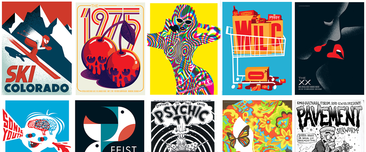
Ski Colorado poster, 2014; concert poster for The 1975, 2016. “The design process is one of discovery and exploration. I don’t sketch up an idea and then sit down at the computer to execute that sketch in a tighter form. The point of entry is not some ‘a-ha’ moment where I see the complete solution. Instead, it’s recognizing a path that might lead to a solution.”—Dan Stiles, “You Don’t Have to Start with a Good Idea, You Just Have to Finish with One”
DIRTY OLD ORACLE
After graduating with a sociology degree, he began a series of “unbelievably shitty jobs, making less money than I had in high school.” He took any kind of job he could get: factory work, construction, landscaping, house painting, and cooking. To improve his design skills, he worked at night, art-directing a magazine, making posters, and teaching himself to print color posters. His first color poster commission came from the Willamette Valley Folk Festival. The poster was a huge success, despite the fact that his previous experience had been “designing skulls and flames, not flower-crowned folk bands.”
While finishing a poster at Kinko’s one night, a “dirty old man” approached him. “My first instinct was to tell this dude to get lost, but it turns out he was printing T-shirts for that folk festival,” Dan says. “He invited me to help him.” Dan spent the rest of the summer working with the filthy oracle: “He was, in fact, a dirty old man,” he recalls. “He operated from a shop behind a liquor store on the outskirts of town, sleeping on a couch next to the press. It was 110 degrees Fahrenheit in the press room because of the oven he used to cure the inks. The place reeked of body odor and plastisol. I could deal with the heat, but the guy kept porno mags stashed behind the buckets of ink. When I’d pull down the bright red, a magazine would drop down with it. He had, shall we say, varied and unusual sexual appetites. I bailed by the end of summer, but I learned a lot about printing from this guy.”
Stiles soon got work at better prepress and print shops, building his skills. One night while eating a dinner of tortilla chips (“due to lack of income”), it occurred to him that he’d benefit from “formal training and a proper career.” He was accepted at the California College of the Arts (CCA) in San Francisco, “with a little scholarship money and a whole lot of loans.” In 1996, he moved to San Francisco—hooked again, but this time by student loans and San Francisco’s fetishistic and inbred culture of design.

Holy Mountain–themed skateboards for Sleep Skateboards, 2016.


Sophie Madeline LP packaging, 2012. “The spark that leads to the finished idea can come from a variety of places. And it takes work. I sketch dozens of ugly thumbnails, make paper collage, listen to a band’s music to get their vibe, check out the lyrics, make lists, experiment with shapes. I don’t like to think about ‘seeing’ things. For me it’s easier to create things, then look at them, revise them, combine them, and finally, through a collage-like process that I learned long ago making posters and screen-printing, arriving at a solution.”—Dan Stiles, “Always Finishing with a Good Idea”
CCA, MICHAEL CRONAN, AND SAN FRANCISCO FLAME-OUT
After borrowing thousands of dollars for tuition, he knew “if it didn't work out, I’d be living in my parents’ basement for the rest of my life.” It was “do or die.” He threw himself into his coursework and freelance career. “Years of experience in the field at all those crappy jobs had provided me a substantial advantage over my classmates,” he says. “The ‘desktop publishing’ revolution was still young, so few students, and fewer teachers, had any computer experience. My years of printing and digital prepress combined with my manic work ethic led directly to jobs inside my professors’ studios.”
One of those professors was the late, great Michael Patrick Cronan, who hired Dan during his third year at CCA and became his mentor. Working side-by-side with Cronan, Dan says he learned more about design than he’d ever learned in his life: “Michael pulled me into the design A-League.”
Concert poster for Odesza, 2015; concert poster for Sonic Youth, 2006 (“I did about a dozen different designs before I arrived at this one. It had to be perfect,” says Dan); concert poster for Feist, 2007.
After three years with Cronan, Dan opened his own shop in 1998. That same year, he met Mel Thompson, an architect and jewelry designer, now his wife. “We met when Dan crashed a blind date a mutual friend of ours had set up. He was a total ass for about the first year we dated. I’m not sure why I stuck with it other than our shared sarcastic, dark, biting sense of humor. We would often be the only two people in the room laughing at a joke.”
After seven years, Dan was over San Francisco: “For me, San Francisco was mostly about making run-of-the-mill design for run-of-the-mill tech companies. It was a golden teat but creatively stifling…. Every company was the same, and they all wanted the same thing. Everyone wanted to be Apple, but none of them valued design enough to actually get there.” The city’s high cost of living also meant you had to take what you could get. “This made it difficult for designers to stretch their creative legs,” he adds. In 2001, Dan and Mel Stiles left San Francisco for Portland, Oregon.
Black Metal Kitteh (personal work), 2015; book cover for The Sisters Brothers, 2011; standup arcade cabinet for Google, 2015. “I wish I had a list of a five-simple-steps process to killer design, but I don’t. It’s always difficult and scary. I find the best thing to do is to just get started. I work until I shake something loose.”—Dan Stiles, “Always Finishing with a Good Idea”
WORK, FAMILY, AND NEW PRIORITIES
Now the parents of two daughters, the designers live in a four-level house that serves as both home and office. Dan’s studio is on the third floor; Mel’s is in the basement. The family shares the two floors in between. Most of Dan’s clients are based outside of Oregon; some are outside of the United States.
"Design is a shamanistic task,” he says, "best done alone, and in private. I need to get my mind on track and focus without interruption for a few hours to get anything done.”
He adds, “I think maybe more than settling down, moving my studio to Portland allowed me to grow creatively. For the first time in a decade, I had enough space to actually make my own work,” he says. He’s no longer heavily into the Northwest scene: “Design and family are my passions now. To be good at those two things, I had to forgo a lot of things I enjoyed before.”
Concert poster for Wilco, 2015; concert poster for The XX, 2013; concert poster for Arctic Monkeys, 2014. “Traditionally my process started with research and sketching, then once the idea was all worked out it was executed. Each step along the path required a higher level of commitment to one single idea. Technology has changed that. The computer has blurred the line between thinking and executing; I can be halfway through drawing something, and if a better line of thought reveals itself I can follow it and see where it goes, double back to earlier iterations, or collapse multiple designs into a single piece. The processes of ideation, sketching and executing are now happening simultaneously.”—Dan Stiles, “Always Finishing with a Good Idea”
In 2015, Dan wrote One Thing Leads to Another to explain his philosophy and process. The title reflects his initial belief that his work was a series of “happy accidents.” Now, however, he recognizes it as rigorous and methodical. Fittingly, he has come up with a creative metaphor that perfectly explains the process through which he creates his extraordinary designs:
Let’s say you’re looking for a lost hiker. It is not an “accident” if you find the hiker. The process you use to find someone lost in the wilderness is methodical. You go down a dead-end path, then turn back. You establish landmarks so you don’t repeat mistakes. You eliminate impossible directions through trial and error. Gradually, you narrow the options until you find what you're looking for. I might not know where the hiker is, but I know how to find them.
Dan Stiles is never lost. He is always somewhere on a path to where he wants to be.
Flight of Fancy, Reading Is Fundamental, 2012; Lions (personal project), 2011.
July 19, 2016
Author Matthew Porter calls Atlanta home. A graduate of Georgetown University, he began his career in PR but soon found design more satisfying, serving at Bright & Associates (Los Angeles), Rod Dyer Group (Los Angeles), Wages Design (Atlanta), and Lippincott (San Francisco), from which he was justifiably fired in 1996. He started PorterWrite in 1997. He contributes to Communication Arts and Neenah Paper’s Against the Grain. He shares his happiness with his husband George and four spoiled dogs. He loves what he does.
Layout: Nicolle Rodriguez