When you meet Brooklyn-based illustrator Marcos Chin, one of the first things you might notice are the tattoos that extend from one wrist to the other, each representing pivotal moments in his life: for instance, his move from Toronto to New York is captured in a tiger (representing his lunar symbol), the ends of romantic and professional relationships are symbolized by sparrows and bamboo stalks, and the birth of his nephew is represented by a dragon—the literal translation of his nephew’s Chinese name.
It’s apt that an illustrator would capture moments in his life story permanently, in ink. But what you won’t see are the earlier life-changing events—most of which took place in a classroom—that led Chin to a career in illustration.
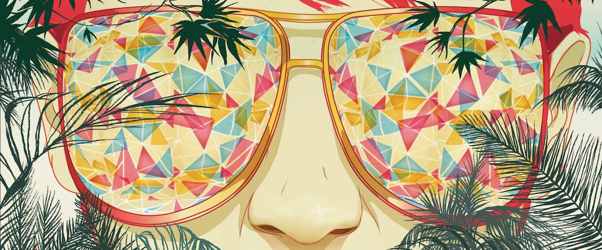
Recent editorial illustrations by Marcos Chin—see more of his work on his portfolio site.
“When I was growing up in Toronto, my seventh-grade homeroom teacher always incorporated art into the classroom, and she was really supportive of my work—she actually paid for me to go to art camp, knowing that my parents couldn’t afford it,” says Chin. The ten-day camp was his first time away from home, and the experience fed his nascent love of illustration. At the same time, Chin’s father, a former draftsman, often came home with comic books and graphic novels as gifts for Chin and his older brother. As he grew older, Chin wove those earlier influences into his work, along with anime, fashion, and the work of street artists including Keith Haring.
CREATING OPPORTUNITIES
After a few fine-art classes at York University failed to inspire him, Chin made a brief detour, enrolling in business courses, before applying to OCAD University in Toronto (telling his parents only after he had been accepted). One of the teachers there owned a small publishing firm and invited his students to submit spec work as part of the course curriculum, paying for illustrations that appeared in print. Although Chin wasn’t able to enroll because the class had filled up, he approached the professor outside of class and was invited to send samples to one of the firm’s designers, who offered him freelance assignments from his junior year on.

An illustration by Chin from the children’s book Ella.
And he hasn’t shied away from new opportunities since then. Early in his career, when he was thirsty for work from newsstand publications, he’d create three illustrations designed to draw the attention of the art directors at GQ or Sports Illustrated—a tack that met with success, as evidenced by his sizable portfolio.
KEEPING THINGS FRESH
Chin admits he’s got a short attention span, which explains why he’s plunged into so many different media: editorial illustrations for Bloomberg Businessweek, Harvard Business Review, the New York Times, and Women’s Wear Daily, among others; advertising commissions for Fiat, Game of Thrones, Lavalife, and Target; books ranging from kids’ fare to the Kama Sutra; and textile prints used in creations by fashion design team SUNO.
Chin’s very diverse portfolio includes advertisements for large retailers and illustrations for a new release of the Kama Sutra (about which he explains, “My approach was to use plant and nature metaphors to imply the sexual acts described in this guide book”).
Textile designs by Chin, used in apparel by SUNO (photos featured on Vogue.com).
“I get bored very easily, and I’m a perpetual student, so for better or for worse, when I feel as though something isn’t making me happy, I’ll just pivot—to different design disciplines like art, fashion, colorings books, or children’s books,” says Chin. He has enrolled in classes at the Fashion Institute of Technology and interned with fashion designers including Gemma Kahng and Antonio Azzuolo, where he learned about sewing and manufacturing. When he’s not teaching at SVA, he’s enrolled in night classes focused on topics like animation and printmaking. And although he creates most of his work in Adobe Photoshop and Illustrator, he loves using his hands: in his Brooklyn studio, you’ll find an airbrush, sewing machines, and a loom, along with clay and sculpting materials.


Chin illustrations commissioned by Fiat
When we spoke, Chin was in the midst of several projects: illustrating the cover for a young adult sci-fi novel with a gender-fluid protagonist, crafting a dummy for his own children’s book, and working on a mural for an elementary school in Queens, which, along with a previous commission for Starbucks, is yet another opportunity to leave a mark on the landscape of New York—a constant source of inspiration.
“I have a huge amount of respect for so many artists and designers who have either lived in New York or passed through the city during their career, and I’ve always wanted that to be part of my career legacy as well,” he says. “I’m constantly coming across new and unexpected things on a daily basis—as someone who loves to learn, living in the city has a real visceral impact on me, and gives me the things I need in my life right now.”
BEHIND THE SCENES: ‘BIG OPPORTUNITY IN SMALL THINGS’
Below, Chin takes us through the creation of one of his illustrations.
1. Planadviser art director SooJin Buzelli asked me to create an illustration for an article; the concept was “finding big opportunity in small things.” I created an initial sketch in pencil, and then I scanned it into the computer.
2. Buzelli wanted me to revise the composition, so I redrew the sketch in Photoshop using the brush tool.
3. I still wasn’t happy with the main figure’s pose, so I redrew him again in Photoshop.
4. I combined pieces of those initial sketches as a template to draw the scene in Illustrator; I placed the drawing on one layer and loosely traced the sketch using the pen tool.
5. I wanted the illustration to be a little moodier, so I changed the entire color palette.
6. I separated the figure from the environment because I wanted to soften it a bit. Although I often use Illustrator to create flat graphic shapes, sometimes I find that the shapes appear too “digital” or too “clean” and don’t quite communicate the mood that I want to capture. When this happens, I bring the entire drawing into Photoshop to create a more hand-done feel.
7. You can see in parts of this figure that I’ve made marks by hand. Using the head as an example, I layered on ink for the hair.
8. When I move between Illustrator and Photoshop, I allow my knowledge of printmaking to inform my process. In this example, I drew on top of my vector images a little bit and then layered the figure on top of the background to complete the image.
9. I added some lighting to give the figure and space more form and depth, as well as atmosphere.
Near the end of the process, I felt the piece was too monochromatic and needed some warmth, so I altered the colors of the figure again. And once again, I added a few more hand-made textures to warm up the piece as a final step. (The final illustration is below.)

November 16, 2017
Author Scott Kirkwood is a frequent contributor to HOW, 99U, and Adobe Create. A freelance copywriter and creative director focused on nonprofits and “do-gooder” brands, he lives in Denver, Colorado.