Who: DIA Studio
What: Graphic Design, Editorial Design, Typography
Where: https://www.behance.net/dia
Behance member since: 2010
A core team of three people—Mitch Paone, Meg Donohoe, and Deanna Sperrazza—make up DIA Studio, but the trio works regularly with a pool of close collaborators on design and identity projects, such as a music-release visual identity that caught our eye on Behance.
For this project, the team designed 12 typographic covers for 45s, thinking about “each single cover as an individual piece of typographic art,” says Paone. He explains, “The goal of each cover was to embody both the music and relate conceptually to the track title.”
He continues, “We created a minimal typographic identity for the booklet and packaging to support the intensity of the individual artwork. To give the layouts an added layer, we brought in a looping motif that is pulled from the front and back cover of the box and repeated throughout the spreads and the record labels.”
Paone describes DIA’s identity work as somewhat untraditional. “While we apply rigorous traditional design skills, most of our concepts are first tested in motion and flexible interaction rather than in print,” he says. “There is definitely a kinetic dimensionality to many of our projects, even when they’re in the most basic printed format.”

IN THE LOOP
It’s easy to see that style in the covers DIA Studio developed for “In the Loop,” a compilation of remixes by DJ and producer A-Trak. The team established the parameters that each cover had to be unique, except from their shared black and white palette.
“We first researched conceptual visual references that related to each title and allowed them to drive the creation of each piece,” Paone explains. “Overall, the process naturally led us to a diverse selection of covers that can stand out individually but also feel a part of a larger series of work.”


Paone says that for the cover (and subsequent animation) on the left, “We set the letters in a sequence to reference how gravity creates a cascading effect when bombs fall from an airplane. We also chose a heavy typeface to give it some weight.” For the cover on the right, Paone says the studio “altered and distressed the text to reference what you see with carbon dust in magnetic field science experiments.”
The covers project is part of a full rebrand and identity system DIA is creating for A-Trak. See more of “In the Loop” on DIA’s Behance page.
TOOLS OF THE TRADE
A handful of the individual artworks for the A-Trak project were designed exclusively using video effects software Adobe After Effects CC. “Almost all the core Adobe CC applications get plenty of use at DIA: Adobe Illustrator CC for sketching design and illustrating ideas, Adobe Photoshop CC for image-making, Adobe InDesign CC for meticulous editorial work,” Paone says. “However, I’d say our favorite program is After Effects. We love to use it as an image-making tool, not just as animation software. You can export a still of something in After Effects using the multitude of scripts, plug-ins, and effects that can be far more compelling than anything you create in Illustrator and Photoshop.”
Beyond the Adobe suite, the Glyphs app is a DIA Studio favorite for type design work. The studio also uses Cinema 4D and praises how well it integrates with After Effects.
POWER-BRAND IMPRESSION ON A SMALL SCALE
The kinetic dimensionality of DIA’s work can also be seen in the logo and identity the studio created for GIDI’s online gift-giving bot.
“The most important and visible brand piece was the chat app avatar,” Paone says. “Our challenge was to make a power-brand impression at such a small scale.”
The team settled on a logotype that is a fusion of a logo mark. The letter Is (which evoke ribbons, a nod to the gift-giving service) can live separately as graphic elements or appear as part of the full GIDI logotype.


A LIVING AND BREATHING DESIGN
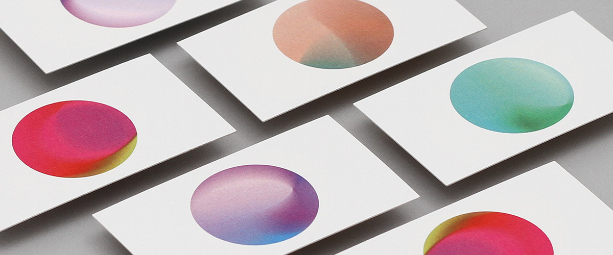
DIA Studios also developed branding for Primary, a health and wellness company.
“As with GIDI, the identity is quite complex, while looking deceptively simple at first glance,” Paone says. “To get the color interaction to feel fluid and organic was challenging, since the process was completely technologically driven.”
What’s unique about Primary, he says, is that the logo system is a living and breathing mixture of colors that change form continuously. “The variable color palettes are used to inspire human feelings that are rooted in color therapy psychology,” he explains.

March 1, 2017