Aesthetic Apparatus’s Michael Byzewski starts each new design—whether it’s tea packaging or a concert poster—with found images from a wide array of sources.
In 1999, Michael Byzewski and Dan Ibarra started dabbling in screen printing and poster design in their spare time, spending their evenings and weekends in the basement of an artists’ co-op in Madison, Wisconsin. In time, they had enough work to quit their day jobs at a design studio and turn their hobby into a profession, crafting gig posters for the likes of Cake, the Decemberists, Dinosaur Jr., and the White Stripes.

Aesthetic Apparatus has collaborated with the band Cake on numerous designs.
In 2001, the duo relocated to Minneapolis, where they produced posters for events at First Avenue—the nightclub where Prince first made a name for himself and the backdrop for many of the scenes in the film Purple Rain. (As of March 2016, Byzewski is a one-man operation.)
Although Aesthetic’s work for Cake is well known, the band’s visual style was actually initiated by lead singer John McCrea, who created Cake’s early album covers. When McCrea saw that Aesthetic Apparatus was doing similar work, he reached out, initiating a long partnership that has led to box sets, T-shirts, and other ephemera. But Aesthetic Apparatus has also produced packaging for the Criterion Collection and Andrews & Dunham Tea, as well as editorial work for Esquire, McSweeney’s, the New Yorker, and the Washington Post.
Aesthetic Apparatus has worked with Esquire and the famed Minneapolis music venue First Avenue.
FINDING INSPIRATION
Byzewski’s primary goal is always to leverage “found art” in a way that sets a specific tone, but those results vary widely with each scavenger hunt he undertakes.
Andrews & Dunham approached the agency years ago, with the hope of creating packaging that didn’t look like every other box on the shelf. For their Black Sunshine tea blend, they asked for something in the style of a 1970s sci-fi movie poster—hence the psychedelic colors and stencil type paired with radiating lines and ominous iconography. With Visit Mount Gray, an Earl Grey tea, the client envisioned mountain lodge scenery with a twist: simple line art with Sasquatch roaming in the distance.
Aesthetic Apparatus created unusual package designs for tea company Andrews & Dunham.
“Clients generally come to the studio wanting the personality that I put into the process,” says Byzewski. “I try to be really up front, letting them know that my illustrations are created with found art, so if you’re looking for something specific like an Arabian horse with a three-foot pigtail, it’s just not going to happen.” Sometimes that means turning clients away, but when that trust is there, it opens the door for some unique collaborations.
“When I begin a project, I don’t do sketches in the traditional sense—I start collecting images that feel right for that particular project without really thinking or analyzing the decisions too much, just going with what looks right. Often, that process leads me down an entirely different path than what I expected—and those projects tend to be the most successful. When I start off with what seems like a ‘great’ idea, I’m quite often terribly wrong. So I’ve really come to embrace this ‘working from the gut’ approach.”
LOOKING TO THE PAST
Byzewski’s extensive collection of old books, magazines, and newspapers—with peculiar yet compelling titles like Head Anatomy Pertinent to Dentistry and Denture Prosthesis, Sportsmanlike Driving, and Electronic Servicing magazine—would be at home in any flea market. Many of his favorite publications date back to the ’50s, ’60s, and ’70s, but he also turns to modern sources with age-old, copyright-free imagery like Flickr’s Creative Commons.

These two found images (on the left) were used in a poster for a Romantica concert (right). (Click to enlarge.)
“I’ve found that I’m attracted to images that have some level of familiarity,” he says. “Images that feel like they’ve lived a bit, but that I can present in an entirely different way.”
Byzewski tends to avoid images that evoke a specific time period, favoring those that provide a more timeless sense of nostalgia. He says that iconography with a Mid-Century Modern feel is now too commonplace, and he’s noticed that images of hands, heads, eyes, and insects have become old tropes, so he’s trying to broaden his own horizons.
“When I talk to people about my process around found art, people inevitably ask me if I’ve ever run into legal issues—which is perfectly fair—and the answer is no,” says Byzewski. “I rarely use an image as-is—by the time I’m done with it, it’s not recognizable from the original, and it’s used in a completely different context. It’s just about being smart and being careful.”
Byzewski shared these photos of some of the source material he draws from.
A DIGITAL TOUCH
As you might expect, nearly all of that digital manipulation comes courtesy of Adobe Photoshop CC and Adobe Illustrator CC. “I use Adobe tools on a low level—to make images look rougher or to add chunky half tones—which means I don’t use a lot of the programs’ bells and whistles,” he says. “But even so, I can’t imagine working without them.” He’s also got dozens of textures he’s found or created over the years, to make the final result look “a little less perfect.”
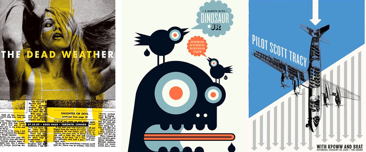
Gig posters by Aesthetic Apparatus.
Because so much of Byzewski’s bread-and-butter gig poster work is ultimately destined for the squeegee, the forced simplicity of screen printing inevitably works itself into his other projects: “Even when I’m designing a website, I’m generally thinking in terms of a limited color palette and envisioning how the file would work on press,” he says. “Three to four colors is generally the most I’ll ever use; the idea of full-color imagery hurts my brain. It just doesn’t look right unless I know I could print it myself.”
See more of Byzewski’s work on his portfolio site.
March 21, 2017