Who: Studio BBG
What: Typography, Graphic Design, Motion Graphics
Where: https://www.behance.net/bewegtbildgrafik
Behance member since: 2014
Brothers Beppo and Robin Albrecht work together as Studio BBG, or Bewegtbildgrafik—an animation and graphic design studio based in Stuttgart, Germany.
“Most of our studio work combines colorful graphics with playful animations,” Beppo says. “We love to bring things to motion by experimenting with digital or analog techniques, and finding new ways of expression by mixing them.”
SUBWAYS OF NEW YORK
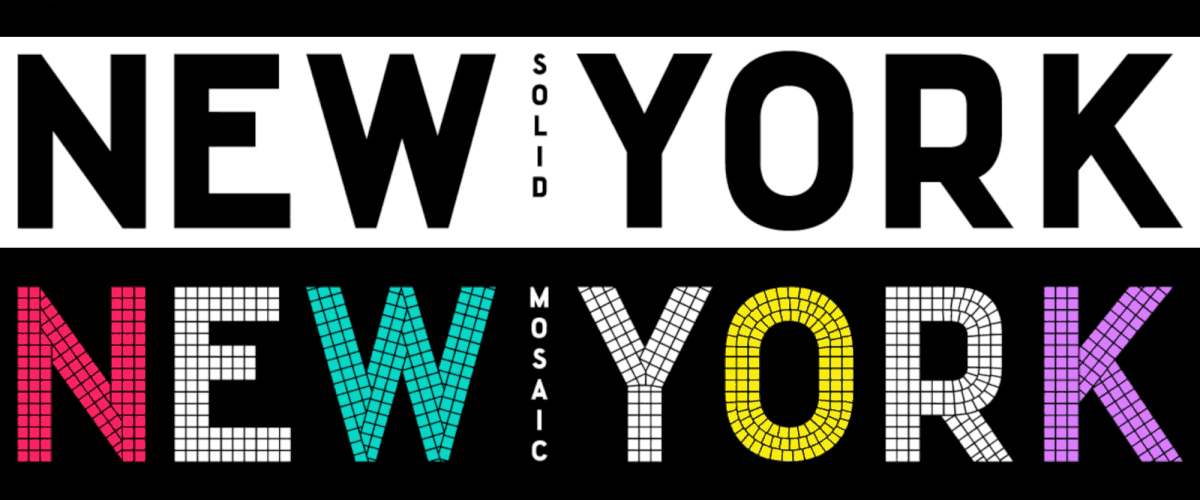
The brothers created the NYC Subway Font together.
“The project started with just a few letters, which we drew as part of a motion design project for a client; the client didn’t expect us to design a whole typeface,” Robin says. “However, after illustrating a few letters, we liked the project and developed them further as a fun studio project.”
Their inspiration came from a trip to New York City. The mosaic tiles of the city´s subway fascinated them; in particular, they loved the contrast between the old handmade underground signs and the modern, fast-moving city.

“It´s interesting to analyze how they put together all the little tiles—how they cut them to display the shape of a letter. We also loved the resulting patterns and the unique details of each character, the impression of depth when two strokes cross—the ampersand sign, for example—or the overlap, as in the W,” Beppo says. “We absolutely wanted to integrate them into one of our studio projects.”
To reveal the project’s origin, the brothers have combined the typeface specimen with some black and white photos they took in New York. They wanted to show the old letterforms in bright colors in reference to the “new” colorful NYC transit map and original wayfinding system by Massimo Vignelli.
To create a usable typeface from a set of single letters, Beppo and Robin had to design an entire alphabet—including characters one wouldn’t usually find on underground signs, such as punctuation and currency symbols.
“The shape and dimension of each letter are more or less defined by the resolution of the tile grid,” Robin says.
They used that square base grid to build all the missing characters and ensure that they were compatible with each other. Finally, they designed individual icons like the arrows and smiles. For small sizes, they also created a second cut with the same shapes but without the mosaic structure.
The duo used Adobe Illustrator to draw all the characters before putting them together in glyphs to generate a working font to be used in Adobe After Effects, Adobe Photoshop or Adobe InDesign. These—along with Maxon Cinema 4D and Glyphs—are their favorite design and typography tools.
ANIMATING STROKES
Studio BBG’s 3D Stroke Lettering project shows a very different aesthetic and skill set.
“A client asked us to develop a setup to create 3D stroke lettering that can be used as headlines,” Beppo explains. “We had done a lot of classic hand lettering up to this point, but we’d never really tried to bring the handmade look of a stroke into 3D to create real depth and be able to animate the strokes.”
To accomplish this, they created many different handmade brush strokes and combined them with simple Illustrator paths in Cinema 4D.
“Inside Cinema 4D, we played with different materials, colors and lights,” he adds.

On this project’s Behance page, the brothers show different steps from the process and some animations.
UP NEXT
Beppo and Robin are starting work on animations in larger formats: live visuals for a concert and a projection animation for a shop window.
“We’re really excited about leaving the small screen and the given aspect ratio behind and doing animations for unusual formats, big sizes or onto objects,” Beppo says.
They are also working on our new show reel, which will soon be available on their homepage and their Behance page.
July 6, 2017