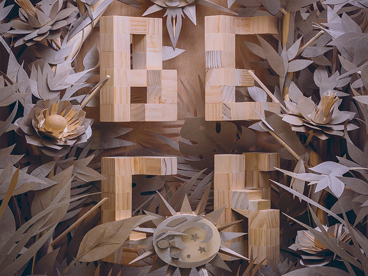

In the fall of 2018, Brian Yap and Lidia Lukianova spent 200 hours in a 10'x10' room inside the Adobe San Francisco office. They went through sheet after sheet of wood veneer and so much Super glue that Lukianova temporarily lost her sense of smell. The end result: a 3'x3'x2' sculpture that, when photographed, became the poster celebrating Beck’s performance at the 2018 Adobe MAX conference.

Click this thumbnail to download the Beck poster file (a 2.8MB JPG). It’s yours to print, use as digital wallpaper, or anything else, but please do not distribute or sell the file or prints.
BEAUTIFUL UNPREDICTABILITY
Adobe creative director Yap and art director Lukianova are accomplished illustrators who have collaborated on the MAX posters for several years. Their usual medium is Adobe Illustrator CC or Adobe Illustrator Draw, not wood, but that’s why they were drawn to the unfamiliar material. “We spend a lot of time working with digital tools that mimic or expand on traditional analog things,” says Yap. “To draw with a pencil or cut shapes out of paper is like remembering where our tools came from.
“There's a beautiful unpredictability with analog materials,” Yap continues. “When you work in digital, you envision what something should look like and you produce it in the app. But when you’re shaping with your hands, unexpected things happen, and you may realize that it’s not a mistake—it actually looks cool. You reach a place that you’d never get to otherwise.”


Click the left and right arrows to view the slideshow. Lukianova sketched the letter forms and then made paper models to be sure they’d work in three dimensions. Yap built the wooden versions out of small blocks of balsa wood he glued together, sanding the edges. After testing placement with boxes and tape, he bolted the letters to the rear panel using basic IKEA tools.
Although Yap and Lukianova normally plan every step of a project, the physical limitations of the material forced them to improvise. “The material was almost like another art director,” says Yap. “It kept changing our minds along the way. Certain things just started to fit better than others, and you wouldn’t know until you started to work on it.”
After they had bolted the letters onto the back panel, they began to build the surrounding jungle. They cut almost all of the pieces by hand, although if you look closely, you’ll see an occasional sphere they bought ready-made.


Click the left and right arrows to view the slideshow. When Lukianova sketched the original concept, she thought they would realize it in paper. “But wood doesn’t bend like paper,” she notes. “We had to figure out how to make it bend.” Yap experimented with cutting dowels apart and rejoining the pieces at angles, while Lukioanova made paper prototypes of some of the more complex elements, such as the lotus in this slideshow, before she and Yap attempted the elements in wood.
Two unexpected qualities of the wood veneer were its color variations and subtle shine. Both characteristics enhanced the overall composition.
As they built up the scene, they took test photos to gauge whether individual elements worked in context. Some parts, such as the waves in the front, looked too dominant in photos, so Yap and Lukianova reduced their size and softened their curves. “Because the sun and branches and leaves are sharp and spiky,” Lukianova explains, “we needed some rounder shapes to add more of a flow.”


Click the left and right arrows to view the slideshow. The first photo is a good example of the veneer’s color variations. The other shots document the evolution of the waves in the foreground.
Through the test photos, they also realized that to get the correct aspect ratio for the printed poster, they would have to cut out some of the foreground. Instead, they decided to expand the sculpture by adding sides and continuing the lush decoration.
“It didn't get tedious at any point,” says Yap, “because it was such an exciting thing to try.” But eventually, the poster printing deadline—and a shrinking stock of veneer—forced them to declare the sculpture finished.


Click through for a closer look at the sides of the sculpture.
LO-FI LIGHTING
Now Yap and Lukianova were ready to work on lighting the sculpture for the photo that would become the poster. Rather than take the sculpture to a photo studio, they improvised a studio in the same 10"x10" room.

“I bought a bunch of LED lights at Home Depot,” Yap says. “For gels, I got transparent colored file folders from a school supplies shop.” “He also tried glow sticks, which completely failed,” Lukianova adds with a grin.
“It took hours to figure out which parts and pieces cast shadows, and whether the shadows looked good,” Yap says. “We did a bunch of tests. Lidia directed the lighting and I moved a lot of stuff around until it was the way we wanted it. It was fun—it was like lighting a movie set, but with dollar-store supplies.”
They shot the final photo with a Canon 5D Mark IV.
ADDING AUGMENTED REALITY
In the past several years, the printed MAX posters have also had a digital component; for example, after installing an augmented-reality app, you can point your phone at the poster and watch parts of the artwork move on the phone’s screen. Yap and Lukianova wanted to continue that tradition with the Beck poster.
“An AR component almost always makes sense,” says Yap. “There always seems to be a reason to want to add more content, but you don’t want the printed piece to be too busy. And then, the idea of having static graphics come to life still feels a little bit like sorcery. It’s exciting to play with.”
At one point, they considered stop-motion animation, but it would have required more time than they had. In the end, they chose a direction that resonated with Beck himself, whose albums, videos, and stage shows range from quiet to vibrant sounds and colors.


Click to play the Beck poster AR animation (left) and a screen-capture video of a phone playing the animation while pointing at the printed poster (right).
The AR animation begins with a digital glitch. Lukianova describes it as a “transition from the 3D world into a dream state.” In the printed poster, the “BECK” letters are a subdued element of the overall scene, but in the AR animation, they flicker with energy and color.
The duo used Adobe After Effects CC and Adobe Premiere Pro CC to design the animation, outputting a standard movie file that they then took into HP Reveal to produce the augmented reality. "HP Reveal essentially skins a movie file on top of a printed piece," Yap explains. "The first frame of our movie file is the printed poster, so if you have the HP Reveal app on your phone, you can point the phone at the poster and you'll appear to see the poster, but then it kicks over to the animation."
Yap and Lukianova have developed their AR skills by trial and error. "The loop is only 10 seconds long," Yap says, "but we kept experimenting until we had something that looks good all 10 seconds and doesn't jar the viewer when it goes back to the beginning." "Try different styles and techniques," Lukianova notes. "Don't be intimidated by the tools—you can make them work for you and adapt them to your workflow."
"You have to remember that this video is going to be seen on a phone," Yap says. "If your animation is too in-depth with tiny little things, they'll get missed." Lukianova adds, "You have to keep it crisp. Bold colors and strong shapes are powerful and engaging because they're easy to see."
To experience the AR first-hand, download the Beck poster and the HP Reveal app from your usual app store. Once you install the app, point the phone at a print of the poster—even if it's from a desktop printer—or at the JPG on your computer screen to play the animation.
CONTINUE THE INSPIRATION
To see more of their work, follow the Behance pages of Brian Yap and Lidia Lukianova. To attend next year's MAX at a discount, sign up to be notified when registration opens and you'll save $500 on a full conference pass. Sign up and save.
November 16, 2018