Self-taught visual artist and illustrator Archan Nair creates complex, imaginative, and lushly colorful digital art that expresses his fascination with the interconnectedness of the universe and the mysteries of existence. Working primarily in Adobe Photoshop CC, Nair creates compositions for a wide variety of clients, including Sony, GQ, Samsung, and Nike, as well as his own personal projects.
Visit Nair’s website to see more of his imaginative artwork. And in addition to his other commission work, Nair makes his creations available on Adobe Stock, as a premium contributor.
We spoke briefly to Nair last year, when he was a subject of our monthly mini-profile series “5 & 3/4 Questions”—and of course we wanted to get to know him better. So Nair invited us to join him as he created one of his vibrant, distinctive images. He makes very imaginative use of many of Photoshop’s tools—custom brushes, layer blending modes, and so much more. Dive in and get inspired to explore the far reaches of Photoshop—and the limits of your imagination!
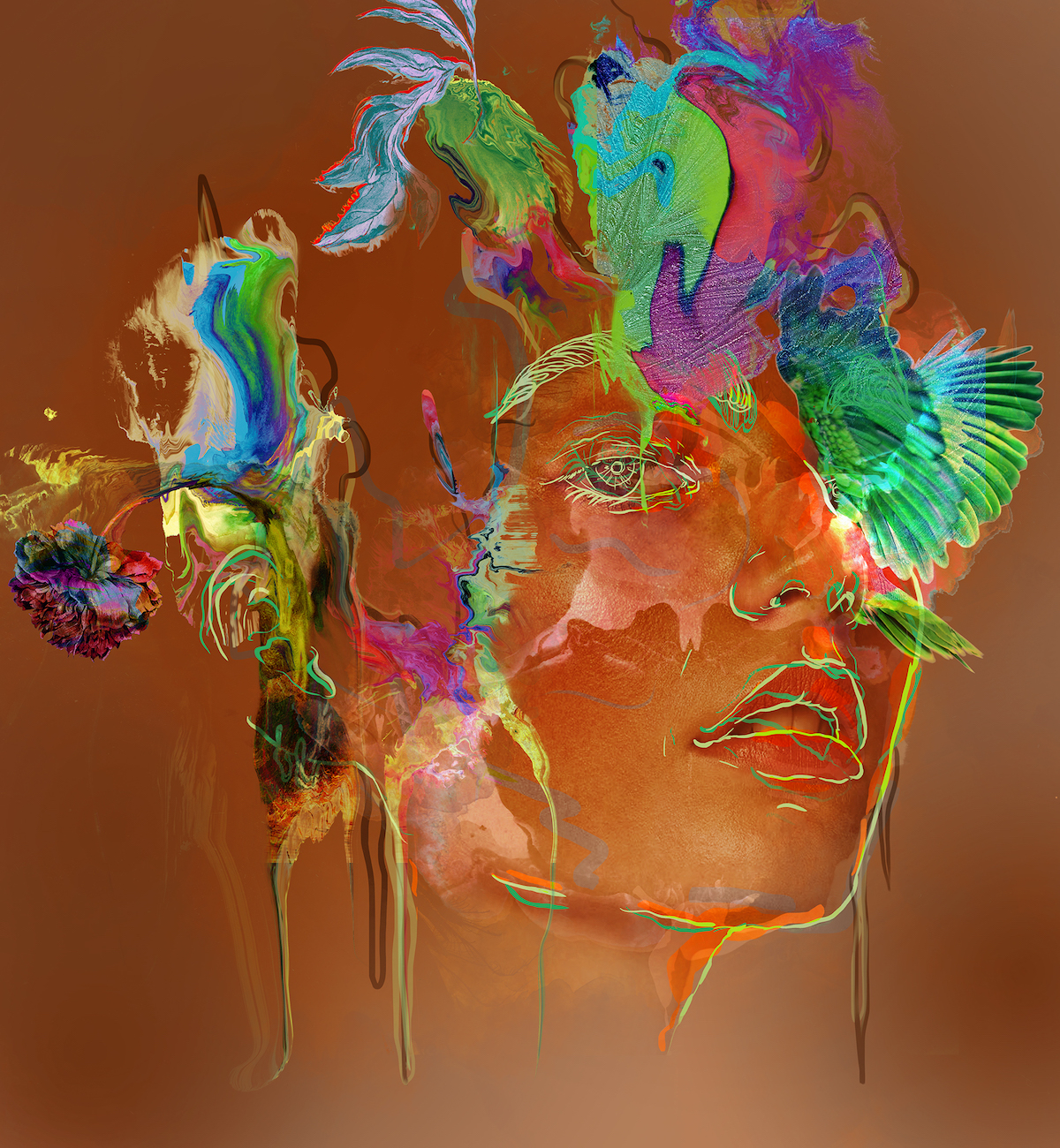
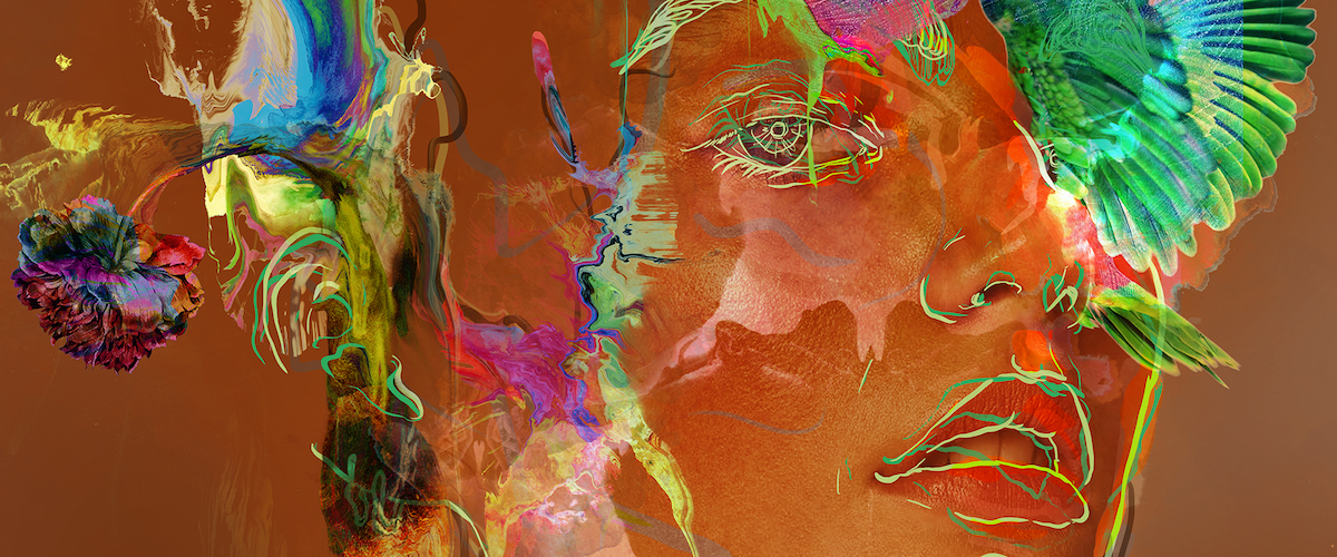
Nair’s final image.
USING A PHOTOGRAPHIC BASE

There are many ways to create a rough canvas on which to begin building an abstract Photoshop creation in Nair’s style. Nair started with a radial gradient layer; he used the Gradient Editor dialog box to experiment until he had a gradient he liked, consisting of two tones of reddish tan. (If you’re new to the Gradient Editor, check out this primer.) He then duplicated this layer, set the duplicate’s opacity to 15%, and changed the layer’s blending mode to Color Burn.
He added a photograph of a woman on a new layer, set that layer’s opacity to 25%, and changed the layer’s blending mode to Overlay. Then he duplicated that layer and changed the duplicate layer’s blending mode to Soft Light.
After making further adjustments, Nair added a layer on which to draw some outlines of the woman’s face, using a brush with sharp edges for definition. Then he deleted the layer with the original photograph on it.
SETTING THE COMPOSITION’S FLOW
Using a simple brush, Nair added some flow lines to the composition, plotting out where he would paint and add details later.

Then he used an uneven abstract brush to paint random sketch-like strokes on the face, creating highlights. (He used a dark color and set the layer’s blending mode to Hue at 41%.)

The next step, says Nair, is where the fun really begins for him. He used one of Kyle T. Webster’s watercolor brushes (at a very large size) on a new layer with its blending mode set to Difference. He chose a vibrant color and painted a stroke. Then, on the same layer, he used another watercolor brush and another vibrant color to paint on the edges of his previous stroke—this created interesting blended color effects within the stroke. (Learn more about using Kyle T. Webster’s brushes in your creations.)
USING THE LIQUIFY FILTER AND ADJUSTING COLORS

With the watercolor layer still active, Nair opened the Liquify filter (Filter > Liquify) and experimented with brush sizes and other tools to create interesting painted effects.

When he was happy with the results of his Liquify experimentation, he adjusted levels in his image—Nair paid close attention the green channel and played with input levels to create a vibrant, highlighted feel.

Then, using the Move tool, he adjusted the placement of his watercolor stroke.
ADDING LAYER UPON LAYER OF COLOR

Nair used the Lasso tool to make abstract shapes in his composition (hold down the shift key while using the Lasso tool to create multiple lasso shapes); then he painted within them with a watercolor brush. With the layer’s blending mode set to Difference, he changed the color to a more bluish tone. At this stage of his process, Nair usually does a lot of experimenting—his goal is to create variations in color and depth.

Then he went back to the Liquify filter and chose the Forward Warp tool and the Twirl Clockwise tool. Applying very light pressure, he distorted his paints and colors. After that, he used a watercolor brush as an eraser (with light pressure and an 80% opacity) to smooth any sharp edges in his shapes.

Nair then used a different brush to paint on the portrait with the same color (still with the blending mode set to Difference), painting over it multiple times to create more texture. He also added more colors, again using the Liquify filter to create interesting variations.
PLAYING WITH COLOR AND PLACEMENT

At this point, Nair rotated and scaled the brush strokes created in the previous step until he was satisfied with their placement (Edit > Transform). He paid close attention to making the elements harmonious, since they are so abstract.

Nair also played with colors, using levels and different channels to bring out a play of colors, as well as highlights and shadows within those colors. Then he repeated previous steps, adding more textures and elements to the image, until he was satisfied with what he had created.
ADDING MORE PHOTOGRAPHIC ELEMENTS

Nair downloaded a photograph of a parrot from Adobe Stock, intending to use just the bird’s wings in his image. He used the Magic Wand tool to delete the white background, inverted the selection (control-shift-I), chose the Lasso tool, and then chose Select And Mask.
His plan was to refine the quickly done selection of the parrot and make it into an elegant cutout. He increased the Select And Mask radius setting and enabled Smart Radius to clean up the selection’s edges.
He used the Refine Edge brush tool and gently brushed over the edges of the parrot. He inverted the selection again and pressed delete to remove unnecessary parts at the edges.
Finally, he used an abstract brush to erase the head and body of the parrot so that only the wings would be visible. Then he experimented with the wings’ placement and used a soft-opacity brush to blend them into the image.
CREATING CUSTOM BRUSHES
Nair used another Adobe Stock image—of flowers and leaves—to make custom brushes. (If you’re new to creating brushes, check out this primer.)

First, he used the Lasso tool to select the leaf and cut it out. Next, he created a new document and pasted the cut image as a new layer. He used the Magic Wand tool to remove the white background; then he disabled the background layer, so the cut-out leaf would have a transparent background.
For this brush, he went to Mode > Adjustments > Black And White and selected the Lighten preset from the dropdown menu. Then he adjusted levels until he was satisfied (he suggests playing with levels to create a nice contrast between blacks and whites, so that when you create your brush, the details register nicely).
After that, he simply clicked on the Brush tool and then Edit > Define Brush Preset, and gave his new brush a name.
When Nair went back to the primary image, he created a new layer and played with blending modes. Nair started with Color Burn; then he used the brush and changed the blending mode to Difference, to create interesting effects. He also went back to the Liquify filter to curve and distort the leaf so it would interact nicely with the shape of the elements, and again he adjusted levels and colors to maintain harmony within the existing color scheme.
He repeated these steps to create a brush out of the flower part of the image.
ADDING FILTERS

Nair uses Nik Collection plugins—for this image, he used the analog Effex Pro 2 filter, and then he applied the Classic Camera 7 filter, which enhances the image’s overall tones quite a bit. You can use any other plugins you like (or simply use layer adjustments). Nair also set the layer’s blending mode to Soft Light 25%.
ADDING TEXTURES
Next, Nair added some textures to the composition.

To do so, select all the layers (control-shift-click) and then click on Create Layer Mask in the Layer toolbox. Nair played around with the blending modes and opacity to create an interesting texture over his image, using the Hard Light blending mode and playing with opacity until he was happy with the result. Then he grouped both of the texture layers and created another layer mask. He also painted over the mask with black, to mask out any hard edges and create more texture around the paints.

Nair then duplicated one of the texture layers and set the blending mode to Vivid Light—he says that it’s important to play with duplicating layers, in order to create more depth and intensity.

Then, using a watercolor brush and a light cream color, he painted over the face, with the layer’s blending mode set to Screen at 65% opacity, adding more depth and visual interest to the image.
ADDING HIGHTLIGHTS AND FINISHING TOUCHES
On a new layer, Nair selected one of Kyle T. Webster’s Belgian Comic Ink pens and a bright blue tone, and he drew on the face, to create highlights. He set the layer’s blending mode to Saturation.
He also painted the eyes on a new layer, setting the layer’s blending mode to Soft Light and reducing the opacity to 50%.

Then it was simply a matter of adding finishing touches. Nair created a new Gradient Map layer with a range from vibrant green to fuchsia, set the blending mode to Saturation and the opacity to 34%, and masked out the image’s center, to create a subtle difference between the main portrait and the background. At this point in his process, he might also choose to sharpen (Filter > Sharpen) the final image or even add another texture.
Check out more of Archan Nair’s work on his portfolio site, and keep up with him on Instagram.
August 3, 2018