
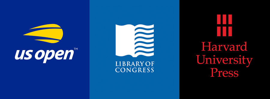
The New Yorker has referred to Sagi Haviv as a “logo prodigy”; Out Magazine has declared him a wunderkind. Both are true, but he is way more than that. Simply put, Sagi Haviv is a force of nature. As a partner and designer at the legendary design and branding firm Chermayeff & Geismar & Haviv, he has created more than 60 identity programs, including the logos for Harvard University Press, the Library of Congress, and the US Open.
Born in Israel, Haviv studied at the art high school Telma Yelin in Givataim. He moved to the United States in 1996 and studied at The Cooper Union School of Art in New York City. In 2003, after interning while still school at what was then called Chermayeff & Geismar, Haviv joined the firm as a designer. Three years later, he was appointed a principal and in 2013, his name was added to the company masthead, the first addition in 56 years.
Sgi Haviv has spent the past 15 years reinventing the company’s reputation. He brings a vitality and clarity to the organization that has both complemented and challenged his partners and has helped usher in a vibrant new chapter to the now 61-year-old firm. Haviv and I have been good friends for several years; we have shared antics in the White House for the Cooper Hewitt National Design Awards, a dance or two at various AIGA Design Galas, and a dreamy photo shoot for Print Magazine. We conducted the following conversation via email, mostly because we knew if we met in person we’d end up gossiping and giggling and never get around to the more serious business of a proper interview.
Debbie Millman: You grew up in Nachshonim, Israel, and studied at an arts high school. You’ve said that for as long as you can remember, you’ve been drawn to and fascinated by simple graphics. How early can you trace that back?
Sagi Haviv: Pretty early. I remember at the age of 12 helping my dad by painting a billboard advertising the kibbutz’s “pool for weddings” business. I was arguing with him to do less decoration and to keep it simple!
Millman: You’ve also noted that perhaps your attraction to visuals is genetic. What did your parents do?
Haviv: Nothing artistic—my mom is a kindergarten teacher and my dad held all kinds of leadership positions in the kibbutz. I think what I meant is that my attraction to visuals feels innate. But the story I was told is that my great-grandfather was a sofer (a calligrapher and scribe of holy texts).

Haviv emphasizes simplicity and functionality in his logo designs. Clockwise from left: Milwaukee Institute of Art & Design; International Tchaikovsky Competition; Heart of Tea; and Women's World Banking.
Millman: After completing your military service in Israel, you moved to New York in 1996 and studied at Cooper Union. You’ve said that New York was calling you. How so? What did you imagine you’d find here?
Haviv: I cannot tell you exactly why I came here and definitely cannot tell you how I dared to come here. When I boarded the plane to New York, I had no idea what to expect. And the first few weeks were tough. I didn’t know anyone, and once I was rejected by Cooper Union on the first try, I was completely lost, alone, and without purpose. When you first get here, it seems that everyone except you is running somewhere—passing you in the street in a rush.
Millman: I understand that Crime and Punishment is one of your favorite books because, as you’ve written, “It encapsulates great complexities, and in spite of its length, is incredibly simple and iconic.” Length aside, the same could be said of your logos. Why does boiling something down to its essence, its most simple and striking, appeal to you so much?
Haviv: I think the challenge of making something super-simple yet distinctive is irresistible and almost addictive. There’s an obsessive aspect to our approach to design. The search for a solution to a design problem does not cease when you leave the office at 6 PM. It’s with you on the way home, at dinner, in the shower.
Millman: You’ve said that the most memorable design-related encounter in your life was the first time you opened a Matisse book. Can you bring us back to that moment, and what you found there?
Haviv: Bold silhouettes; flat, bright colors; arresting arrangements and compositions; extraordinary abstraction—that’s what that encounter was. That’s what we strive for.

Haviv's logos for Imagen and ClearMotion.
Millman: At Cooper Union, you studied with Philippe Apeloig, who you credit with fully turning you on to design. I know Philippe is brilliant, but what did he teach you that resonated so deeply?
Haviv: Philippe has a distinct way of teaching (which is not for everyone). When I would come up with a design for, say, a poster and bring it to class, he would sit next to me on my computer and would start revising (or more often upending) my designs. The poster would end up looking amazing—even if by that time it wasn’t always my original idea any longer. But in the course of this recurring ritual, I would learn an obscene amount about good design. Almost by osmosis, the possibilities he was considering, the decisions he was weighing—about concept, composition, colors, typography, scale relationships, positive and negative space—diffused into me, and I was learning a ton. Today, my design sensibilities and certainly my designs themselves look nothing like Philippe’s, but his passion for design was contagious.
Millman: In your final semester at Cooper, after some begging, Steff Geissbuhler of Chermayeff & Geismar agreed to help you show your work at the firm. You subsequently passed up a full-time job at an ad agency to join Chermayeff & Geismar as an intern three days a week—which you describe as the proudest moment in your design career. Why did you feel such a strong connection to the firm, and how did you eventually parlay the internship into a full-time job?
Haviv: While at Cooper Union, I came across the book TM: Trademarks Designed by Chermayeff & Geismar. I was mesmerized by the simple, crisp shapes and the vibrant colors. And how is it possible that these logos were all made by one company? It became my dream: to work for Chermayeff & Geismar Inc. It seemed remote…
Miraculously, Steff Geissbuhler came to teach a class at Cooper during my senior year. At the end of that school year, I had 60 days to find a job or be kicked out of the country.
So I made a plan to ask Steff for a job. I had the fantasy he might even invite me. In the first class I sat at the very front row gathering my nerves and rehearsing my case. Steff walked into the room and immediately announced, “Just to let you know, we are not hiring anyone, in fact we are firing people left and right.”
After graduation, I became a huge nuisance to Steff, sending him email after email, every couple of days, asking if there is any chance. I was willing to work for three days a week, no pay… and finally after two months of badgering, he said OK.
On the first day, walking into the Chermayeff & Geismar office, I felt as if I had been allowed to enter Mount Olympus.
Millman: You became a partner in 2006, which is remarkable. I’ve always been intrigued by the office culture of the firm—as you’ve described, people come and go as they like, they wear whatever they want, they’re not monitored. You’ve said, “It’s the people with self-discipline who share our design sensibilities that end up staying with us for years.” Is that the key to how you rose so fast in the firm?
Millman: Once, when asked about your best advice for design school grads, you quoted the artist Laurie Anderson, who spoke at your graduation: “Don’t wait to be asked.” How has that philosophy served you in your life and career?
Haviv: That means you can’t expect anybody to hold the door open for you—you have to knock, and ask, and knock again and even barge in at times. That one comment from Laurie Anderson gave me the courage to bug Steff Geissbuhler and get that first foot in the door.
Millman: As for your philosophy on logotypes, you’ve said, “A great mark fulfills three basic criteria: appropriate to the brand, distinctive enough to be remembered, and simple enough to work in every situation.” That certainly resonates in the brilliant marks you’ve created for the likes of Harvard University Press, the US Open, the Library of Congress, Women’s World Banking, and Armani Exchange. Those marks feel like they belong in the long line of output by Chermayeff & Geismar and now Haviv. When you design, are you seeking to create something in the firm’s mold, or are you simply creating?

Haviv: Definitely the latter. But the approach that Ivan and Tom established early on has really proven itself consistently. So our design solutions do end up generally bold and simple in form and based on a single, focused idea. Those work best for our clients.
Millman: You’ve remarked that “a good logo is not about what you like, but instead is about what works.” Has this led to struggles with clients in your career that you can share?
Haviv: Definitely. Every client who walks into our conference room on the big day—presentation day—hopes to be knocked off their socks. They are usually nervous. They allowed us about 10 weeks without interruptions or check-ins (we don’t do those), so by this point, they are wondering if this kind of blind faith they put in us might have been a bad gamble. We start the presentation with a simple slide that says in black type on a white background, “It’s never love at first sight.” We explain that a trademark gains meaning and power over time, and that first impressions can be misleading. That we should focus on the functionality rather than subjective reactions (“I like circles,” “I don’t like sharp corners,” “I love blue”).
But of course all the warnings are out the door when the first logo design appears on the screen. Looking at logos for the first time is almost an absurdity because these things work through familiarity. So over the years we’ve had many struggles to make the case for the merit of a design that we believed in, but that the client might have had a tough time coming around to initially.
In my talk at Adobe MAX, I’ll share some examples of how we’ve struggled with clients and how we’ve dealt with it.
Millman: I know that when you first presented the Armani Exchange “A/X” logo, Giorgio Armani rejected it immediately—but that’s because it was presented to him in-between meetings on a plain sheet of paper. Amazingly, your team was able to get your full presentation before him after the fact—and upon seeing it, he immediately approved the design. What did that experience teach you?
Haviv: We are very disciplined about only showing our logo designs in the context of applications. Nobody would ever see a logo on a white piece of paper or a blank screen. A logo is a vehicle that carries your brand into an environment—so the best way to evaluate and judge it is in that environment. When Georgio Armani saw the new logo in the context of ads, labels, and store signs, he could clearly see it was superior to what he had.

Logos in context: The Library of Congress mark from far away and the Harvard University Press mark up close.
Millman: You’ve said that working with Tom Geismar and, before he passed, Ivan Chermayeff was an incredible gift, and you learned something every day. What are some of their lessons that you hold dear?
Haviv: I’ll provide one from each:
From Tom, I learned to not let the concept take over. Everything we do starts from an idea—and that’s key. But that only gets you so far. Over the years, it has become clear how much Tom truly values functionality above all, and how important it is for a logo to work consistently everywhere it appears.
And perhaps the most important lesson from Ivan (of many lessons) is to never show a client a design you can’t live with if selected. He used to say that they will pick that one, and then we’ll be blamed for it. He always thought about a logo project in terms of this question: Would we be proud to include that design in our next book? And if the answer is no, then the client should never see it!
Millman: You’re passionate about film, and you’ve said that other forms of art inform and nourish what you do. So: What’s your recommendation for a recent flick we should all be watching?
Haviv: Wild Wild Country on Netflix.
Millman: Finally, can you tell us about the new book IDENTITY: Chermayeff & Geismar & Haviv from Standards Manual?
Haviv: It’s turned out to be a beautiful piece, thanks to Hamish Smyth and Jesse Reed, who did a terrific job. One of my favorite parts is Alexandra Lang’s essay in the front of the book. She was able to capture the essence of our practice brilliantly. Ivan would’ve loved this book.
August 16, 2018