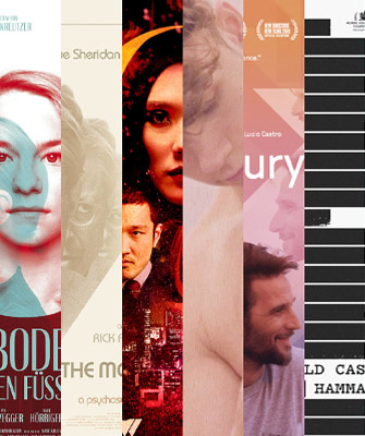
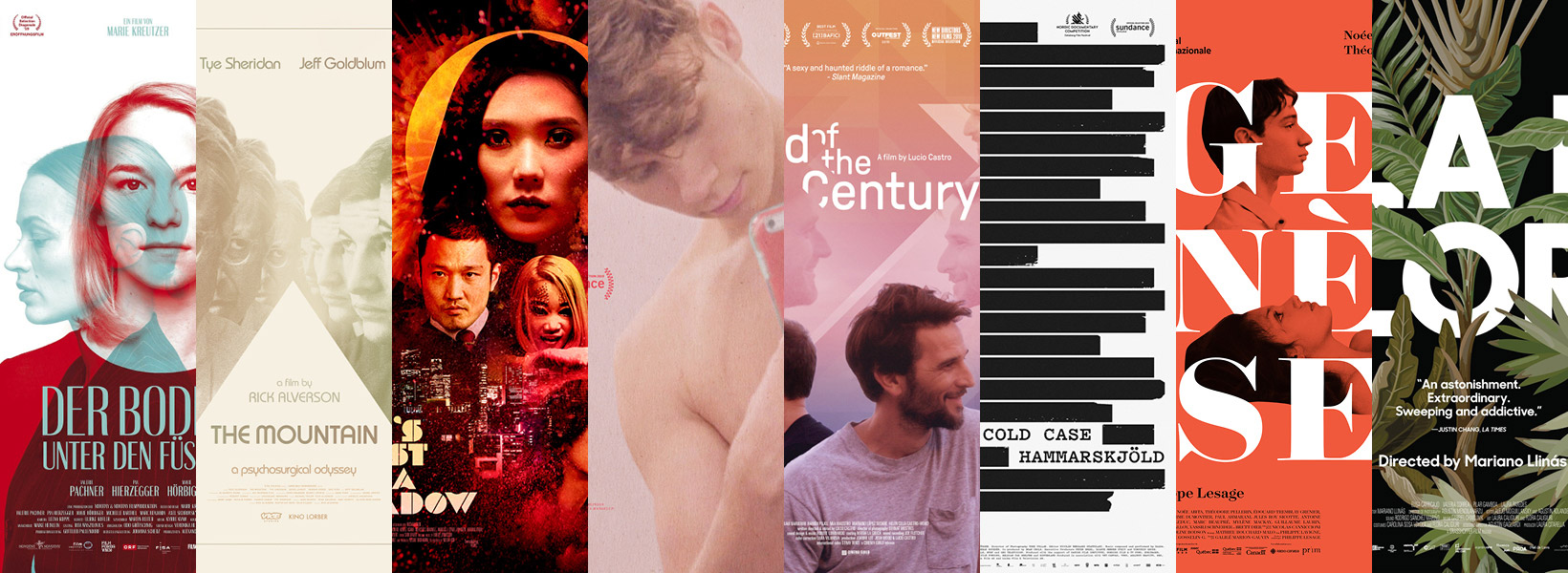
Even though ScreenFonts is a series of reviews focusing on movie-poster typography, I don’t often get the chance to show truly type-driven designs. In this episode, letterforms play a crucial role, even taking center stage near the end, in the posters for Der Boden unten den Füßen (The Ground Beneath My Feet), The Mountain, She’s Just A Shadow, Jawline, Fin de Siglo (End of the Century), Cold Case Hammarskjøld, Genèse (Genesis), and La Flor.
Der Boden unten den Füßen (The Ground Beneath My Feet)
© 2019 Novotny & Novotny Filmproduktion/Picture Tree Int. © 2019 Strand Releasing. Poster design by Visionsbureau/Markus Göbl.
Overprinted monochrome images in dark red and watery green lend a midcentury vibe to the beautiful domestic poster that Visionsbureau’s art director Markus Göbl created for Der Boden unten den Füßen (The Ground Beneath My Feet). Göbl told me that the Austrian drama portrays a woman struggling to find balance between a complex relationship with her boss/secret girlfriend on one side and her mentally ill sister on the other. As the boundaries between the high-performance business world and her guilt-ridden private life start to blur, she finds her grip on reality slipping away. “I visualized the psychological interplay as a surrealistic trio of portraits fading into one another,” Göbl told me. “The contrasting colors refer to the conflicting emotional aspects in the story and its protagonists.” The alternate poster for the world premiere in Berlin—director Marie Kreutzer’s first choice—adopts a softer color scheme and takes a modern approach, literally blurring the boundaries between the three portraits. The dusty pink was changed back to dark red by the international distributor.
The typeface Britannic Compressed—originally issued in the early twentieth century by Stephenson Blake—matches the midcentury mood to a tee. Göbl chose the typeface because he thought the slender, contrasted letters aptly reflected the fragility of the main character’s perception of reality, as well as the precarious dynamics at work in her relationships. The similar Globe Gothic is Britannic’s contemporary; Mark Simonson’s recently released Acme Gothic interprets the thick-and-thin gothic lettering style as an unassuming, dependable family in five widths, each in five weights.
The Mountain
© 2019 Kino Lorber. Poster design by Sam Smith.
Festival posters and teaser sheets (early promotional posters featuring a basic image or design that doesn’t give too much away) offer designers an opportunity to stray off the beaten path and create unconventional, attention-grabbing artwork. Designer-drummer Sam Smith creates intrigue with a cryptic image of two vacant folding chairs in his poster for The Mountain’s entry in the seventy-fifth Venice International Film Festival competition. When I asked him about it, Smith preferred to keep the meaning of the image shrouded in mystery. “It’s in the film,” Smith said. “It’s an image that spoke to Rick [Alverson, the director] that felt significant. And a festival poster allows me to try something different without actors.” But it’s not just the photograph that’s remarkable; the highly stylized stencil type enhances the overall image and plays an equally important role in creating a singular piece of graphic design.
The theatrical one-sheet (27" × 40", the most common film-poster size in the United States) does show actors Jeff Goldblum and Tye Sheridan, but Adrian Curry’s inspired art direction and Smith’s astute execution make the piece stand out from more mainstream fare. Here, Smith relies on the geometry of ITC Bauhaus, one of his mainstay fonts. Although Ed Benguiat and Victor Caruso’s typeface carries the name of the renowned early twentieth-century German art school, the design was merely inspired by its teachings. The Adobe Originals collection Hidden Treasures of the Bauhaus Dessau, however, faithfully revives five original alphabets by Bauhaus students; Type-Ø-Tones turned Bauhaus teacher Joost Schmidt’s modular letterforms into the typeface Joost, which comes in four weights and a stencil variant.
She’s Just A Shadow
Brandon Shaefer likes challenges. With his theatrical one-sheet for She’s Just A Shadow, he demonstrates how to tackle the oft-derided floating-heads genre. By judiciously adding image grain, texture, transparency, and light to the photographic assets, Schaefer makes the composite resemble a lush, vibrant painting. As with the festival poster for The Mountain, the inventive stencil face used here elevates the artwork to a higher level. In a Twitter direct message, Schaefer told me that director Adam Sherman referenced disco album covers from the seventies and Schaefer’s own poster for Bone Tomahawk, so he created titles in that vein.
Quick aside: Sam Smith and Brandon Schaefer join forces as The Poster Boys to share their encyclopedic knowledge of movie posters and insightful commentary in their excellent podcast.
Jawline
Left: © 2019 Caviar. Poster design by Jump Cut/Brandon Schaefer, set in Till. Right: © 2019 Hulu. Uncredited, set in Rongel.
The two posters for Jawline illustrate how typeface choice subtly alters the mood and style of a design. In a message thread on Twitter, Jump Cut’s Brandon Schaefer explained that director Liza Mandelup had a pretty specific vision in mind, which is why both his festival sheet and Hulu’s uncredited theatrical/video-on-demand (VOD) key art run along similar lines. (Key art refers to the iconic image at the center of a movie’s marketing campaign.) Even though there’s a clear resemblance, the images differ fundamentally in their intent. The Hulu version shows Austyn Tester in his social-media star persona, fully in control of his image and directly interacting with his audience. In Schaefer’s poster, however, the graininess of the movie still and the orientation of Tester’s smartphone betray this as an unguarded, candid moment captured by a third party. Someone is observing Tester, who observes himself as he fashions a selfie. Schaefer closely collaborated with Mandelup, who had color and texture in mind, and who suggested the scene that ultimately wound up as the screen grab for the poster.
Schaefer came up with the idea to rotate the type. Not only does it line up perfectly with Tester’s pose, but it also provides a visual cue to the vertical orientation of social-media stories, its stars’ preferred mode of communicating with their followers. The title (supplied by the production company) is set in a rather obscure typeface: Till by Pauline Le Pape, an Amsterdam-based French designer who has an MA in type design from École Estienne in Paris. Its sharp features and idiosyncratic details reinforce the poster’s self-made atmosphere. Hulu changed the type to Mário Feliciano’s Rongel, whose lithe, polished shapes make the poster look more like conventional marketing collateral. Notice how the crossbar on the ‘e’ rests neatly against the border of the photograph. Try ITC Galliard if you favor a more traditional appearance, or Priori Serif if you want something a little more eccentric.
Fin de Siglo (End of the Century)
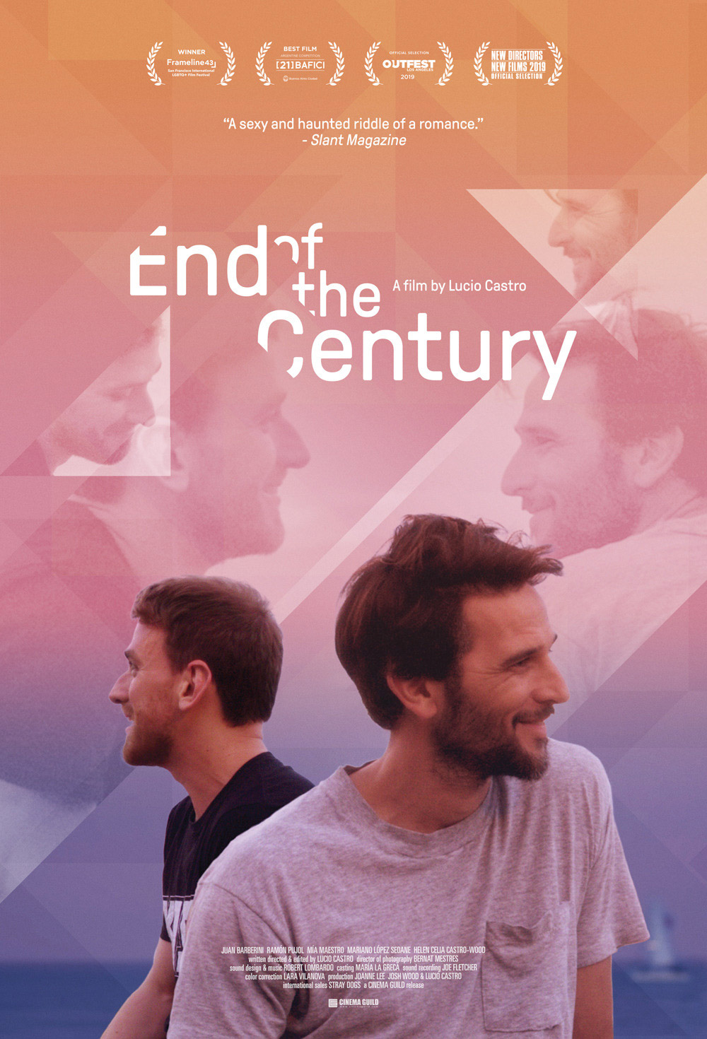
Sometimes it’s not the typeface itself but how a designer uses it that makes a poster stand out. The refreshing typography in the theatrical one-sheet for Argentine drama Fin de Siglo (End of the Century) immediately caught my eye as I trawled through movie posters from the past month(s). Lucio Castro’s debut feature chronicles a romance spanning decades between an Argentine poet and a Spaniard from Berlin. A triangular geometric structure captures ghost images of the two main protagonists and cuts into the type, creating an inventive pattern. In an email, designer Fred Davis told me that the triangle echoes a tile pattern in the kitchen of the Barcelona flat where a good portion of the film takes place.
“I don’t know if the director intended it or not, but the triangles proved an apt motif as the storyline flows between three time periods,” Davis wrote. “The resulting film is a composition of multiple pieces, or tiles if you will. The ghost images imply the characters and their relationship in said time frames: some are engaged and direct while others have their attention elsewhere. They also serve as fragments of memories lost and recovered, as well as wishful longings for an uncertain future. Without giving anything away, there’s a question of what is indeed real and what is imagined.”
Davis felt that GT Pressura’s distinctly modern letterforms with rounded corners suited the story well. He added diagonal cuts to imply depth and to make the type interact with the background. Newlyn’s New Frank exudes the same atmosphere; DINosaur’s stroke endings are even rounder.
Cold Case Hammarskjöld
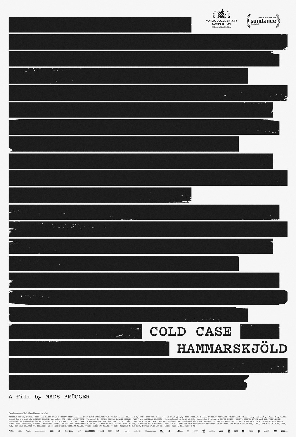
Speaking of refreshing typography, Danish designer Tobias Røder’s work for Cold Case Hammarskjöld deftly avoids the customary distressed typewriter face as a visual shorthand for redacted documents and shady dealings—a trend that is growing old. He took a different route for the film, in which journalist Mads Brügger and Swedish private investigator Göran Björkdahl try to expose the cover-up of U.N. Secretary General Dag Hammarskjöld’s suspicious death in a plane crash more than fifty years ago. Even though a classic, worn typewriter font would have been appropriate for the time period—the events detailed in the documentary took place in 1961—Røder chose Pitch for the powerful key art. The angular serifs with straight 45° brackets (the transition from stem to serif) give the typeface a signature look that enhances the oppressive censor bars covering the canvas.
Other faces that take the typewriter model in distinct new directions include the open-source IBM Plex Mono and DJR’s Input Serif, which are both part of extensive type systems consisting of several subfamilies. JTD’s Array offers users the choice between monospaced (all letters occupy the same amount of horizontal space) and proportional (wide letters take up more horizontal space than narrow letters) within a single type family.
Genèse (Genesis)
If type plays a major role in Røder’s poster, it is on an even footing with the actors in Karine Savard’s striking theatrical one-sheet for Genèse (Genesis). Philippe Lesage’s second autobiographical film is a coming-of-age story about three teenagers whose first love throws their lives into turmoil. Savard makes a statement by breaking up the six-letter title into three stacked pairs, knocked out against an intense red background. In an email, she explained that the director asked her to reference the little-known UK teaser sheet for Michelangelo Antonioni’s Blow Up. Savard swapped Futura Black for the classic-looking Surveyor Fine Bold to echo the use of objects both contemporary and from the past in the movie sets. She also inverted the concept: moving the photographic elements outside the letterforms creates a fascinating interaction between the big capitals and the cut-out black-and-white photographs overprinted on the flat background color. Sandwiching Théodore Pellerin’s portrait between the capital ‘G’ and ‘E’ turns his profile into a quasi-typographic element; Noée Abita intensely gazes up at him through the letterspace between the ‘N’ and the ‘È’. In contrast to the dynamic in the Blow Up poster, this time it’s the woman trying in vain to make eye contact with an absent man. The Little Mermaid statue—a reference to Lesage’s cinema studies in Copenhagen—preserves Abita’s modesty. The quiet sensuality of the composition is intensified by the monumental shapes of Tobias Frere-Jones’ glyphs. Their imposing presence separates the protagonists and emphasizes their solitude. If it were me, I might have set the type flush right instead of centered to make the three consecutive ‘E’s line up perfectly. Visually, this vertical sequence is more important than the slight differences in alignment that would create on the left side.
Similar letterforms with high contrast between thick and thin strokes can be found in Essones Headline Bold, Ambroise ExtraBold, Miller Banner Black, and Escrow Banner Black.
La Flor
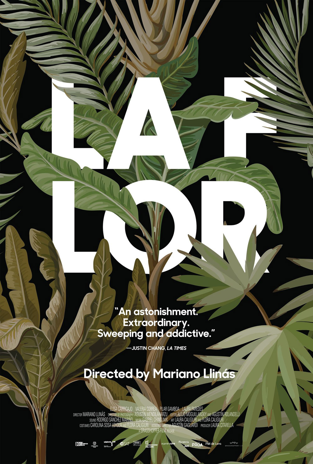
La Flor is a thirteen-and-a-half-hour-long tour de force—six episodes consisting of multiple subplots mixing up distinct narrative and cinematic genres, all structured in unexpected ways and tied together by the same four actresses. Simplissimus’ Scott Meola takes the typographic experimentation one step further than Savard, splitting the title in a surprising spot in his theatrical one-sheet. The initial ‘F’ in “Flor” stands as if forsaken at the end of the first line, with the word continuing on the second line. The unusual break reminded me of Phil Baines’ fearless typesetting experiments in the mid-1990s. Meola suggests depth by having the beautifully painted leaves invade the counter of the ‘O’ and partially overgrow the text set in Sharp Sans Display No. 1. If you like the simple geometry of these letterforms, take a look at Arborio, Objektiv, Sofia, Fieldwork, and BC Alphapipe. Supertype’s Cy explores daring new avenues in the geometric sans model.
Thirteen and a half hours is peanuts compared to the time it takes me to research and write an episode of ScreenFonts, but hey, I’m a glutton for punishment when it comes to type. Now that the summer lull is well behind us, I’m posting on Twitter and Instagram again using the hashtag #ScreenFonts—please follow, like, comment, and come back here next month for another full episode of movie-poster goodness.
