ScreenFonts’ second episode on Adobe Create Magazine ventures into mystical realms and the underworld, and emerges at the other side with a celebration of love and freedom. This time, we'll look at posters for the films Worlds of Ursula K. Le Guin, I Trapped the Devil, Hagazussa, Hail Satan?, Chasing Portraits, Long Day’s Journey Into Night, Instant Dreams, and Rafiki. Note: This episode mentions the Satanic Temple (no relation to the Church of Satan) and features female nudity (artistically shot from the back) near the end.
A BRUSH WITH MAGIC, THE OCCULT, AND THE DEVIL
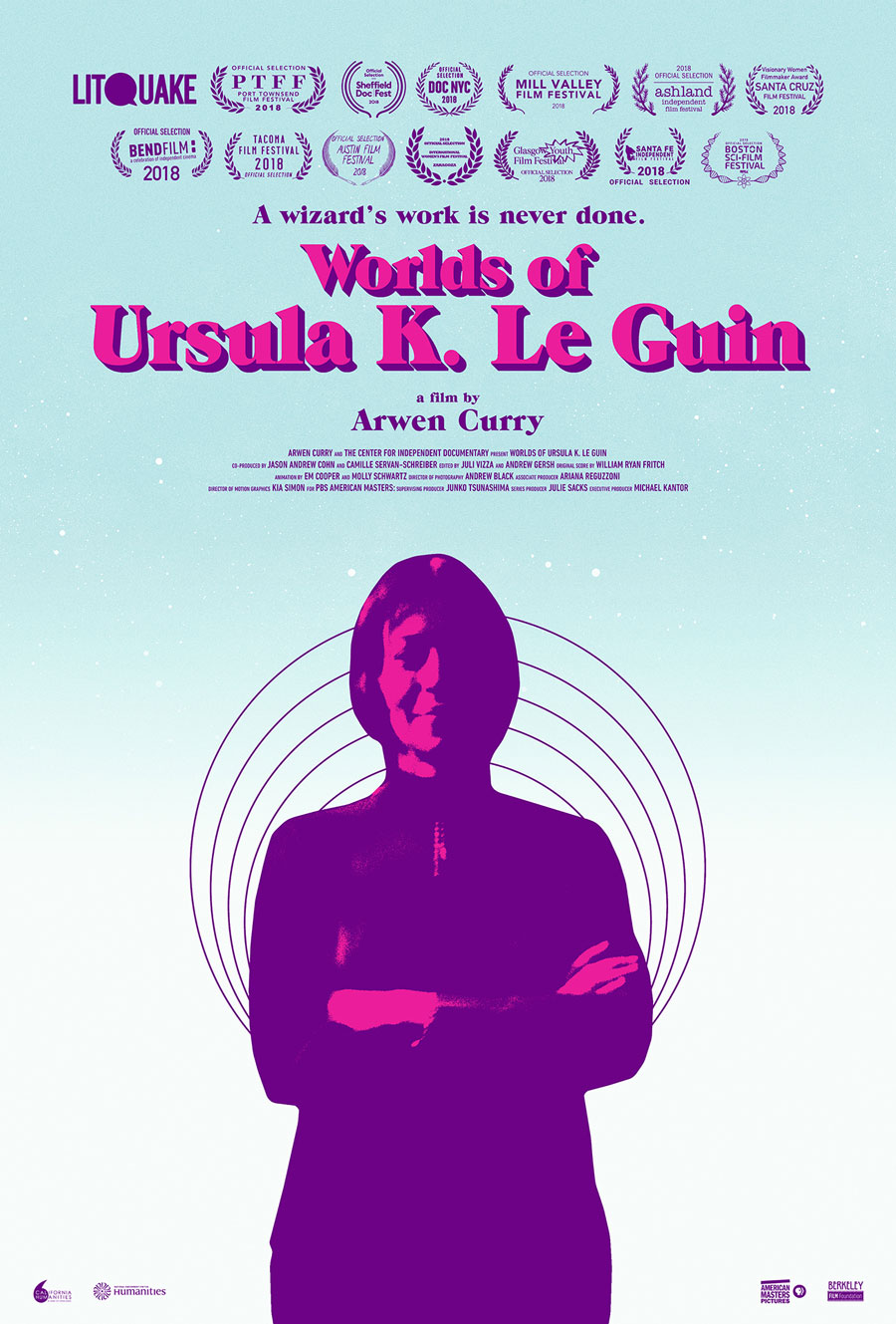
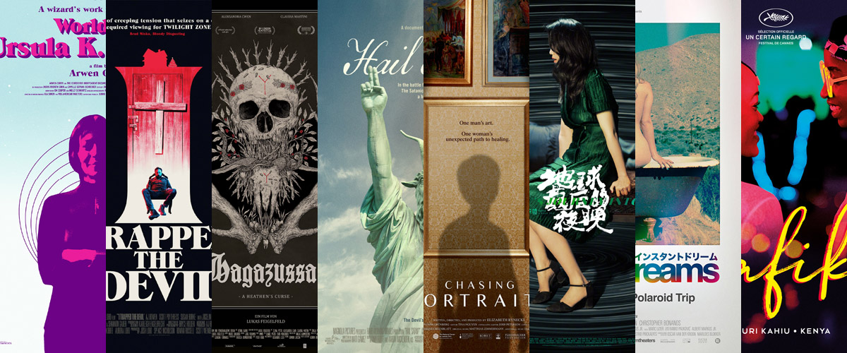
© 2019 American Masters. Poster design by Midnight Marauder (left). © 2019 IFC Midnight. Poster design by Phantom City Creative (right).
One of the genres I discuss in my talks about film poster typography is horror. Ever since Trajan appeared on a film poster for the first time in 1991—together with the other original Adobe Original Lithos—it has had an interesting life cycle. Early on, Trajan was the typeface of choice for epic, inspirational films. Over the past three decades, though, its overuse has gradually tarnished its luster. It has become the default font for all movie posters and has been a staple in marketing collateral for B movies and horror flicks for the past decade or so.
In response to this trend, type-savvy designers started tapping into 1970s and ’80s nostalgia to differentiate their poster art from “lesser” horror productions. They've relied on retro display fonts like ITC Benguiat, Friz Quadrata, ITC Serif Gothic, and ITC Barcelona to conjure up horror-book covers of yesteryear.
While doing research for this column, I spotted a lesser-known display face from that era on two different theatrical one-sheets (27" × 40", the most common film-poster size in the United States): Midnight Marauder’s vibrant artwork for the documentary Worlds of Ursula K. Le Guin and Phantom City Creative’s brooding poster for psychological horror I Trapped the Devil both feature ITC Grouch, a Seventies interpretation of ATF’s turn-of-the-century Caslon boldfaces—see the signature A. The typography is inspired by ’80s book covers, for the fantasy and science fiction author in the former and for horror and suspense novels in the latter, particularly Phantom City Creative’s oversized stacked letters with the gigantic I doubling as the closet the titular devil is trapped in.
Instead of lazily rehashing these old book covers, both posters offer modern-day reinterpretations of retro styles. The posterized image treatment clearly signal that these are contemporary designs, which makes me wonder if maybe it is also time to update the type choices. In recent years, we've witnessed a resurgence in daring, bold type design. Fonts like Tenez, Ohno Blazeface, and Hypocrite (to name but three) adopt the exuberant attitude of display faces from those days and allow users to channel a similar energy while supporting living type designers.
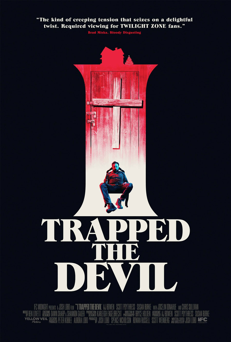
© 2019 Retina Fabrik. Poster design by Lukas Feigelfeld with illustration by Adrian Baxter.
Hagazussa tells the story of a young goatherd in the fifteenth-century Alps who feels the borders of reality and nightmare slowly start to blur into each other after her mother’s traumatizing death. The gorgeous illustrated domestic poster is the first film poster by Adrian Baxter, who does “traditional illustrations based on life, death, and human philosophy.” In an email, Baxter explained to me that director Lukas Feigelfeld had some loose ideas that he was happy for Baxter to expand on as he saw fit. The ominous artwork is a collage of various elements from the movie, with the two skulls the main focus. “The ceremonial human skull represents the somewhat relatable point of view,” Baxter said. “The goat skull and antlers embody the primal, animalistic side, with sticks, berries, and mushrooms linking everything together to remind us that—whether living or dead, good or evil—all is nature, and nature is all.” Feigelfeld added the typography to the illustration and finished the design.
Baxter’s art took shape organically. Viewing the first draft of the movie, alone in the dark, he instantly loved it. He watched it a second time with notepad and pen in hand and sketched every little thing that could be used for the artwork. Eventually, Baxter took those ideas to Feigelfeld to discuss which elements would work on the poster, and how. “I've watched Hagazussa a few more times since, with no sketchpad to distract me,” Baxter said. “It’s still a personal favorite, and I'm honored to have worked on it.”

© 2019 Doppelgänger Releasing. Poster design by Lukas Feigelfeld (left). © 2019 Magnolia Pictures. Poster design by P+A (right).
The peculiar blackletter in Doppelgänger Releasing’s U.S. one-sheet—based on a design by Feigelfeld—is a departure from Cantebriggia, the Gothic script used for the original poster. It reminds me of Adhesive Nr. Seven, Phospho’s experimental broken script built with—the name gives it away—strips of adhesive tape.
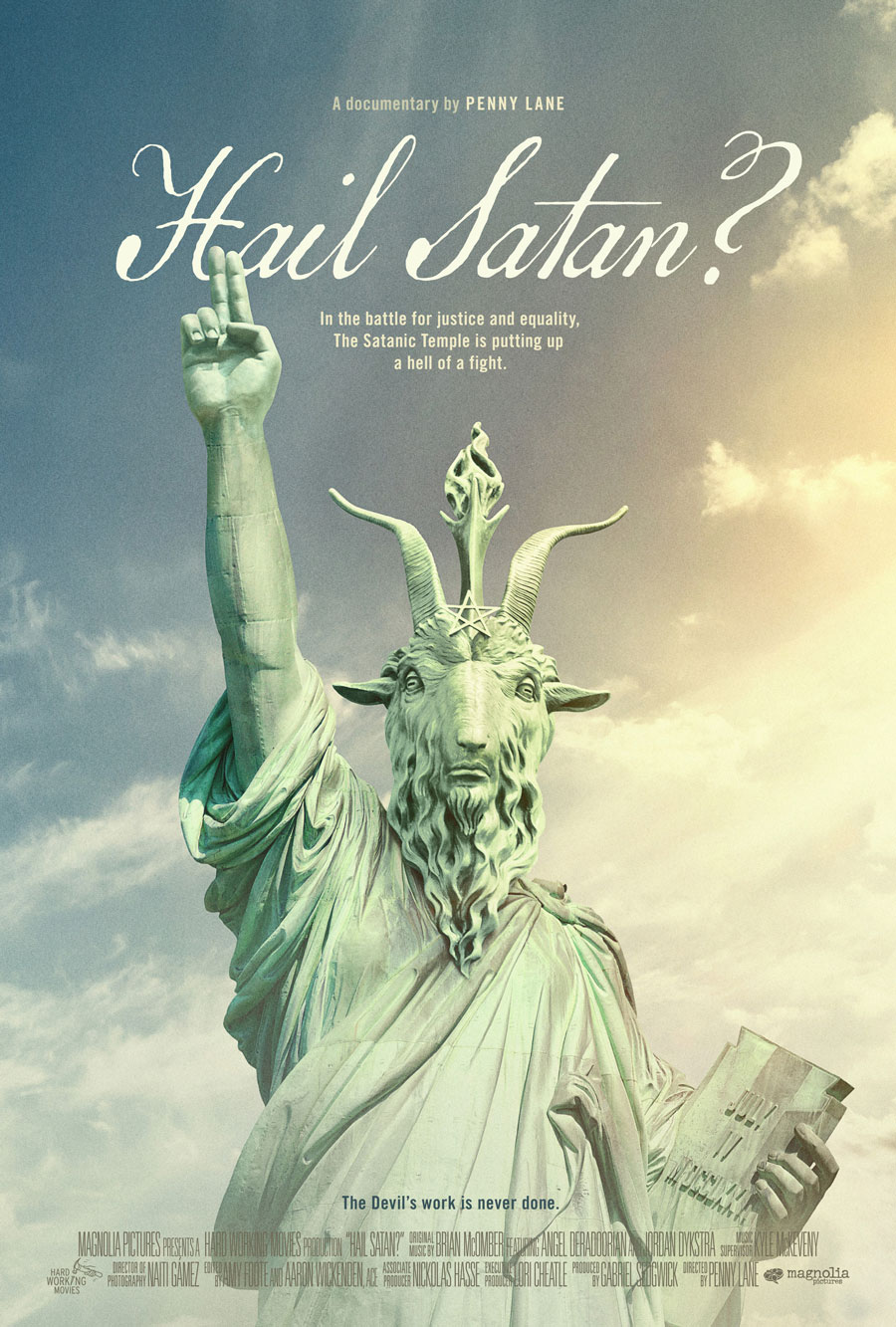
Don’t let the title mislead you into thinking that Hail Satan? is also an unsavory tale about the Antichrist. It is anything but: The documentary follows the efforts of media-savvy members of the Satanic Temple, an international non-theistic religious and activist group, as they use satanic imagery to promote egalitarianism, social justice, and the separation of church and state. P+A’s clever theatrical one-sheet dresses the statue of Baphomet in the Lady Liberty’s robes as visual shorthand for the organization’s founding principles of religious freedom. The antique handwriting font, Three Islands Press’ Remsen Script, seems to be a typographic nod to the U.S. Constitution. That document’s First Amendment enshrines the separation of church and state as well as freedom of speech, two central themes in the documentary.
Quite a few script fonts mimic the look and feel of centuries-old penmanship on rough paper: the model for P22 Dearest was found in a nineteenth-century German book chronicling a history of the Middle Ages, and P22 Marcel is based on the letters a French prisoner of war wrote to his wife during the Second World War.
SEARCHING FOR LOST ART AND A MISSING WOMAN
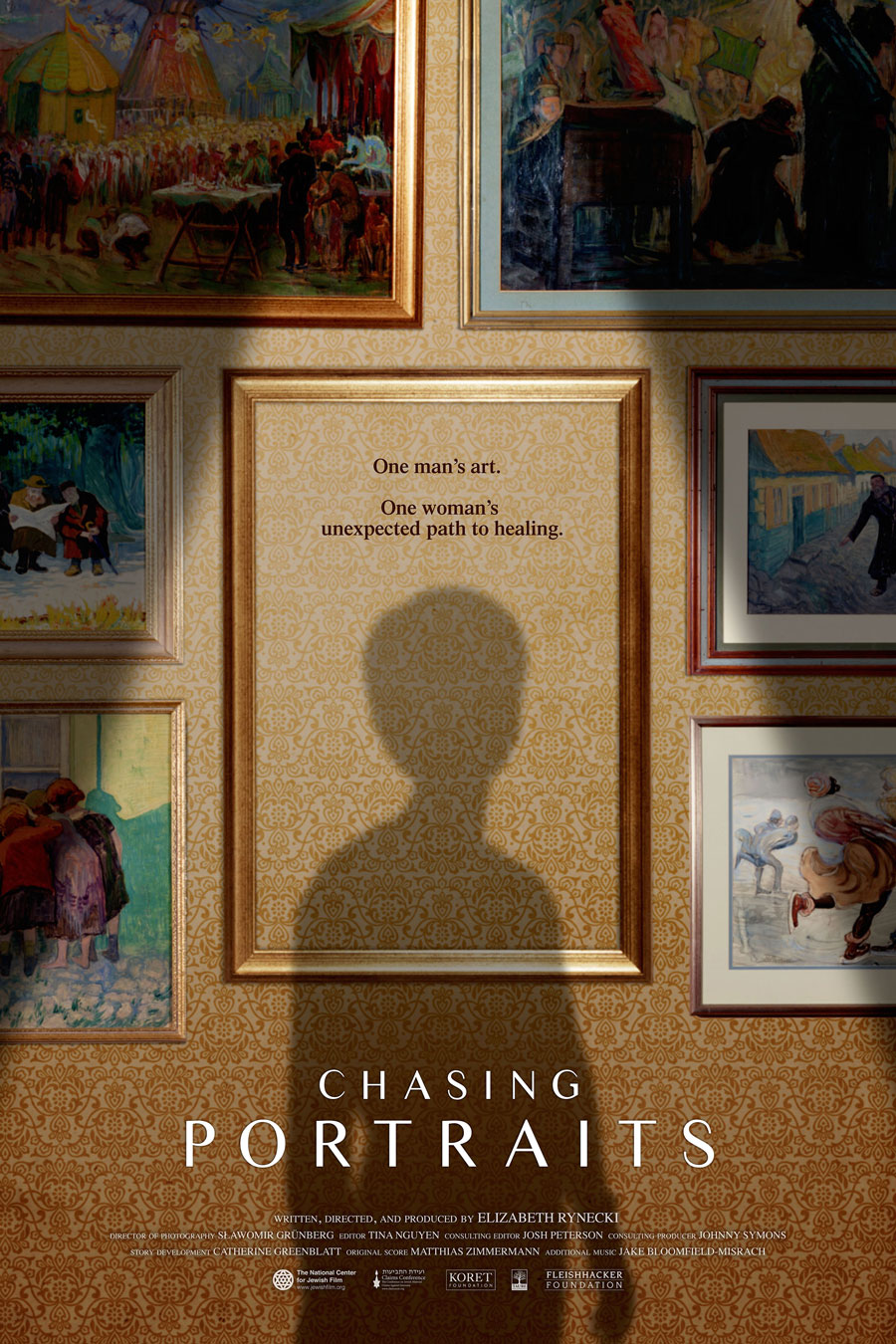
© 2019 First Run Features. Poster design by Otto Is The One.
atHistorical documentary Chasing Portraits follows an American woman on her emotional quest to recover the art that her Polish great-grandfather, a Jew, lost during World War II. Malaysian-born writer and director Yen Tan, a.k.a. Otto Is the One visualized the sense of loss and hope with great empathy by having filmmaker Elizabeth Rynecki cast her shadow inside an empty frame surrounded by Moshe Rynecki’s recovered paintings. Tan’s understated use of Times Sans Serif lends the poster a distinguished cachet. Stylish stressed sans faces like IvyMode and Minerva Modern—sans-serif fonts with a noticeable contrast between thick and thin strokes—are commonly associated with high-end fashion and art, and they lend designs instant class when used well.
© 2019 Dangmai Films and Huace Pictures (all).
China’s all-time biggest arthouse hit, Long Day’s Journey into Night, is a noir-tinged stunner about a lost soul on a quest to find a missing woman from his past. After contacting several distributors and production companies and running into dead ends, I had to abandon my own quest to discover who designed the delivery posters. Even though it makes the English version of the title a little hard to read, the sleek Latin typography superimposed on the Chinese rough-brush calligraphy forms a breathtakingly beautiful typographic cluster. The green gradient of the English title works wonderfully well in all three versions—as a reflection of the shiny green dress, as the complementary hue for the magenta flowers and skin, or as a burst of color in the desaturated, almost monochromatic scene.
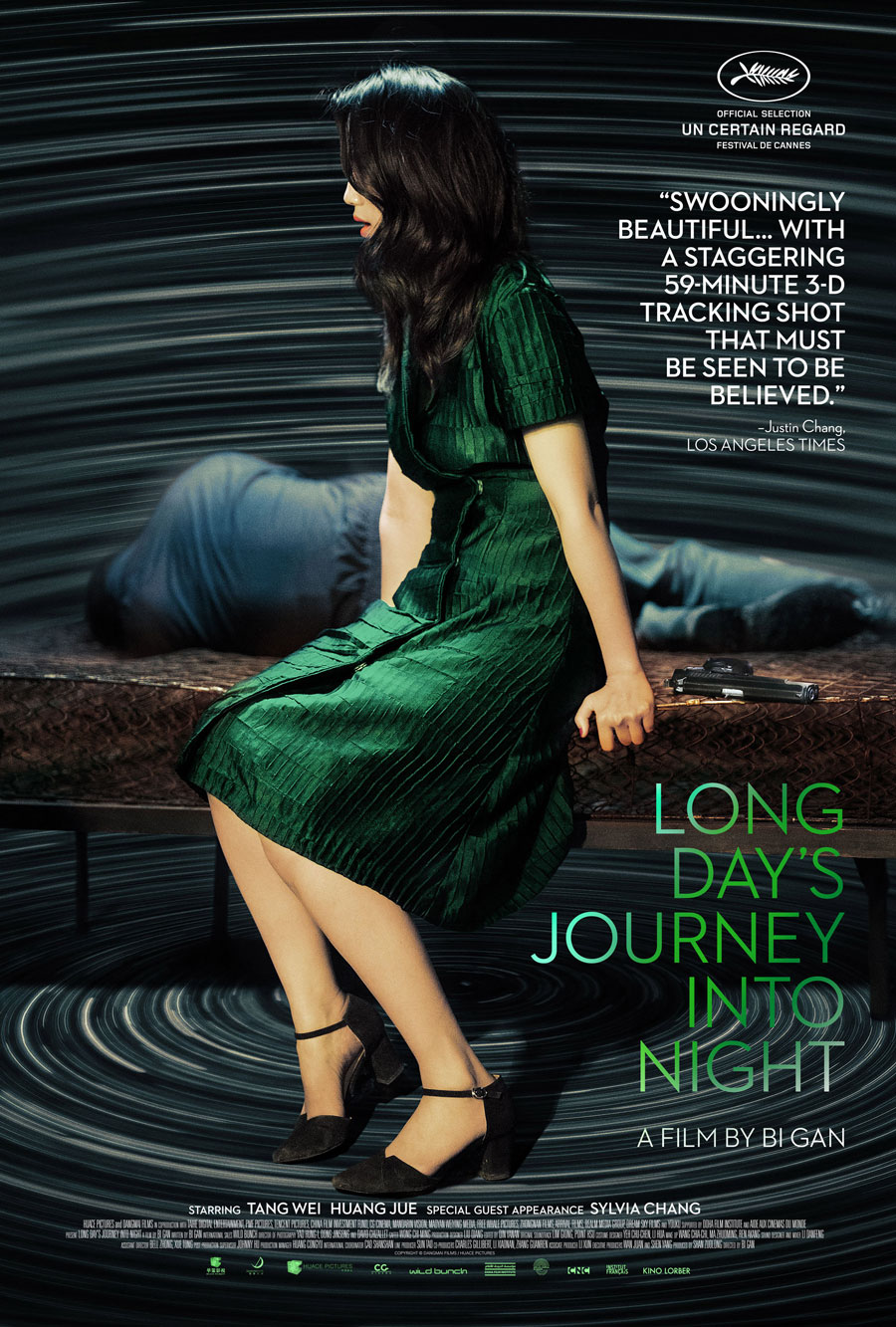
© 2019 Dangmai Films and Huace Pictures. Typography by Adrian Curry.
This specific style of serif font with a dramatic contrast between thick and thin strokes is called “fat face”. While designs like Eloquent JF or Sybarite are standalone typefaces, some fat faces are simply the heaviest styles in larger families—see for example Ambroise ExtraBold, Essonnes Headline Bold, Abril Fatface Huge, or Bodoni URW Extra Bold.
For the U.S. one-sheet, film poster art director and commentator Adrian Curry chose House Industries’ Neutraface and tastefully tucked it in the calm lower right area of the photograph. For similar art deco-inspired sans serifs, see Arboria and Eagle.
LOVE IS FREEDOM IS LOVE
© 2019 Synergetic Distribution. Poster design by Joost Hiensch (Shosho) with photography by Stefanie Schneider.
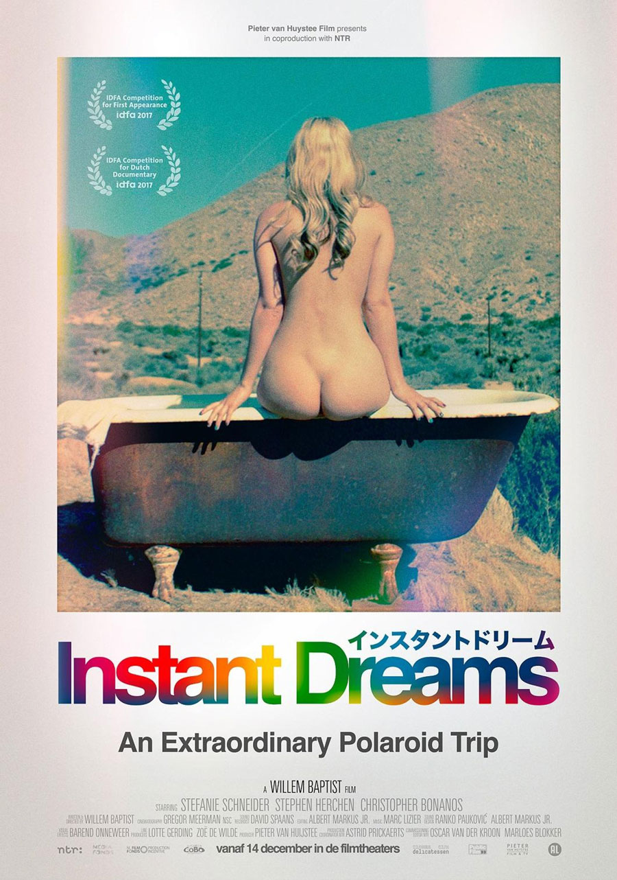
Joost Hiensch of Dutch design agency Shosho chose a dreamlike snapshot by Stefanie Schneider for the Instant Dreams theatrical one-sheet. The documentary recounts the continuing efforts of a small group of enthusiasts and scientists who try to unravel the secret of Polaroid's lost chemical formula to keep the dream of the iconic instant camera alive. The popularization of the Polaroid camera, which coincided with the sexual revolution from the 1960s onward, was a true paradigm shift. It liberated amateur photographers from the fear of being judged by lab technicians and, by extension, society, as photo labs were no longer required to process risqué images. The slightly surreal image of a nude woman sitting in a bathtub in the desert deftly reflects this sense of joy and freedom, and a carefree attitude unburdened by antiquated, oppressive societal norms. Nice detail: The white border around the image freely reprises the proportions of the Polaroid photographs.
While the brand identity for the current Polaroid Originals cameras and film exclusively uses FF Real, the poster harkens back to the original logo set in Helvetica, with the signature rainbow filling the letters instead of appearing as a separate element. If you want a truly authentic digitization of Helvetica, try Neue Haas Grotesk, Christian Schwartz’ meticulous restoration of Max Miedinger and Edouard Hoffmann’s original drawings for Helvetica.
© 2019 Film Movement. U.S. poster design by Nichola Washington (left). © 2019 Aya Distribution. U.K. poster design by Jebet Naava (right).
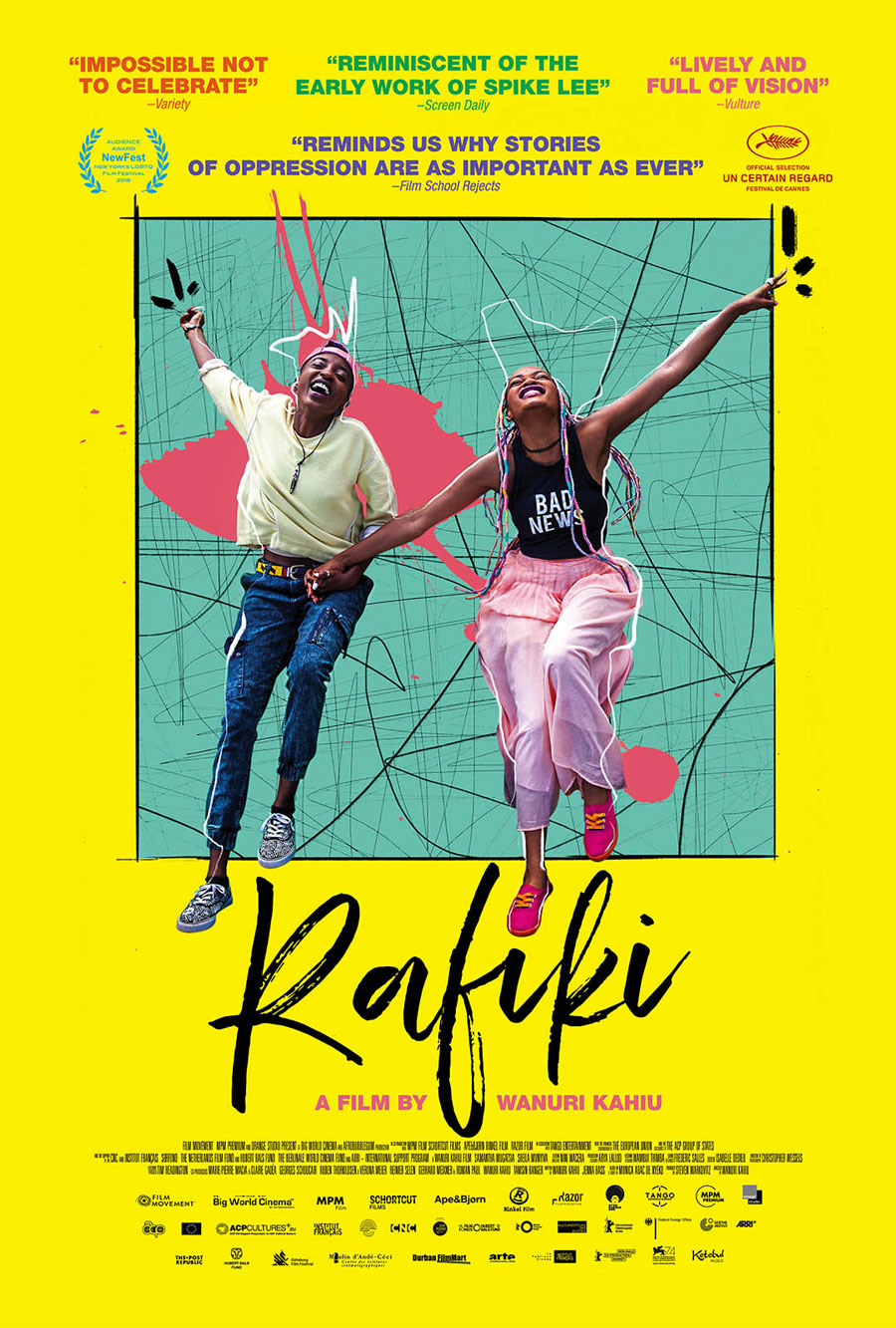
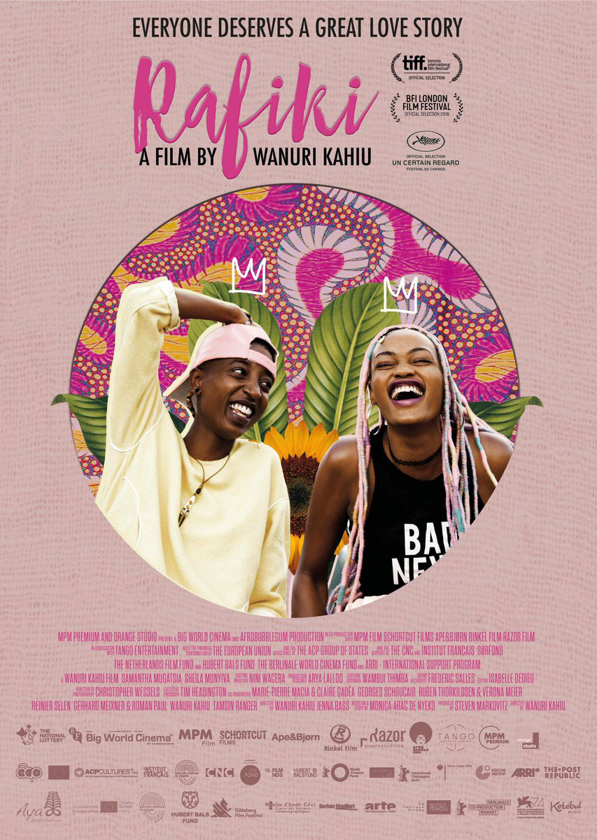
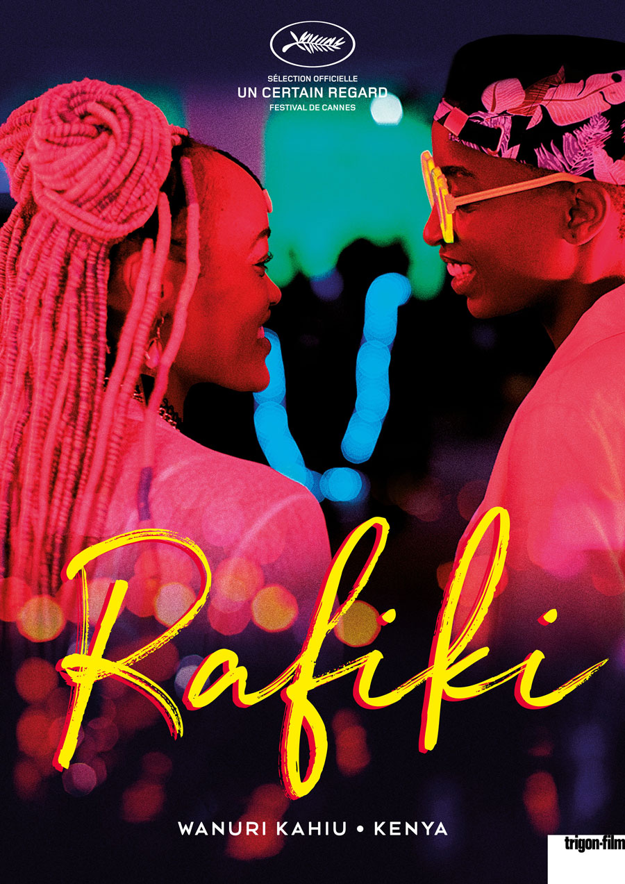
Speaking of antiquated, oppressive societal norms, Wanuri Kahiu’s film Rafiki (“friend” in Swahili) chronicles the love blossoming between two young women amid family and political pressures around LGBTQQIA rights in Kenya. This timely film challenges the larger human rights issues associated with same-sex relationships in East Africa amid worrying developments in the anti-LGBTQQIA climate in recent years. Rafiki was suppressed in Kahiu’s native Kenya, only to see the ban briefly, cynically, lifted so the film could be screened for seven days in one single cinema, to allow the film to qualify as Kenya’s entry for the Best Foreign Language Oscar. It was the first Kenyan film to premiere at the Cannes Film Festival.
The posters for the film vary signiicantly in style. The lovely, brightly colored U.S. one-sheet by Nichola Washington depicts the two lovers literally jumping out of the yellow frame, with the African-American artist’s mixed-media approach combining photography, painting, and drawing. The fine brush script is HeartSoul. The U.K. poster created by Kenyan artist Jebet Naava adopts a much softer approach in violet and pink, featuring the brush script First Take. The two little hand-drawn crowns over the women’s heads and the colorful background collage recur in Naava’s art, but I wonder if she was hampered in this case by too many requirements and restrictions—and, frankly, way too many logos—because her art is usually much stronger and more exciting.
© 2019 MPM Premium
The European versions use a dazzling neon-hued movie still in which the two lovers beam with affection for each other. While the yellow script font looks very much like the one in Washington’s artwork, it is yet another typeface: Northwell. Poring over the Adobe Type catalog, I found Shabby Chic, Timberline, Olicana Rough, and Rollerscript Rough to be very similar in spirit, while Duos and Gloss Drop are alternate takes on brush script writing.
The white, bold Calibre gives the European variant more impact but makes it look more businesslike, thus losing the joyous exuberance of the freeform script. Take a look at Proxima Nova and Heimat Sans for close relatives.
This expression of innocent, pure love and tenderness will keep me going until next month, when I'll treat you to a new episode of ScreenFonts. Can’t wait that long? Search for the hashtag #ScreenFonts on social media for more movie poster commentary.
June 21, 2019