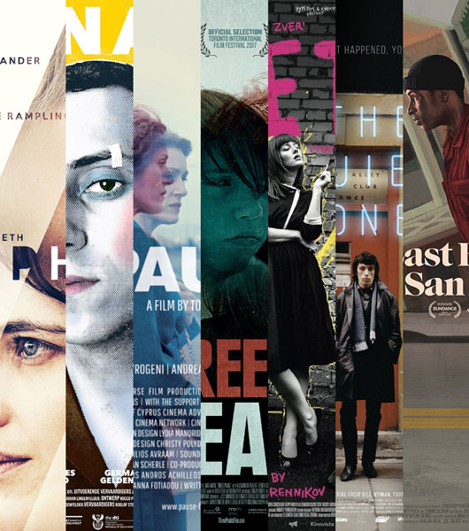
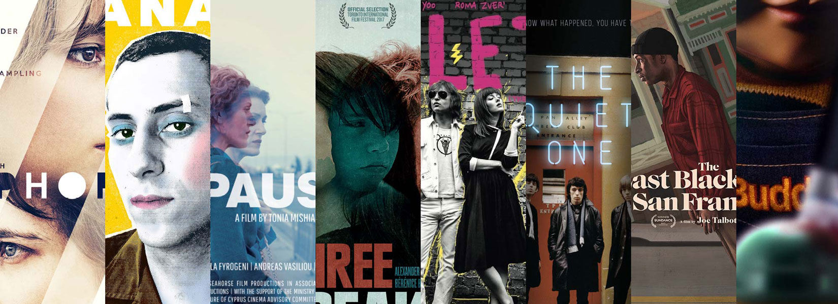
Sometimes a brilliant idea stares you right in the face, but it takes a perceptive designer with a keen eye and razor-sharp wit to recognize and give form to it. Two exceptionally clever concepts take center stage in this episode, which features posters for Pause, Drei Zinnen (Three Peaks), Euphoria, Kanarie, Leto, The Quiet One, and Child’s Play.
Cuts, Not Blends
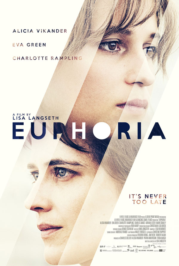
Coffee & Cigarettes’ international one-sheet (27"x40", the most common film-poster size in the United States) for Euphoria applies diagonal cuts to dramatic effect. Creative director Tom Clark of the UK-based agency told me that they wanted to convey a sense of the passing of time and the finite, delicate nature of life. “We concentrated on Alicia Vikander and Eva Green, who play the two sisters, and had them face away from each other, as they are pulling very much in opposing directions in the film,” Clark said. “The sections of the characters’ faces fading out represent the stages of life as youth and health give way to the impending veil of death and eventually infinite nothingness.”
Coffee & Cigarettes adapted Gill Sans by removing the counters (the inside shapes) of the letters P, O, R, and A. More than merely an aesthetic decision, Clark felt it was “part of the poster’s overall theme: exploring the ideas of loss, death, suffering, and one’s own pain / other people’s pain; the relationship between close family members (in this case sisters); the fragility of life; and of course the controversial subject of euthanasia itself.” In combination with the simplified color palette and the rich photographic texture inside the smaller text, the alternately white-and-black title with missing counters lends the poster a surprising, slightly experimental look, a welcome change from most mainstream fare.
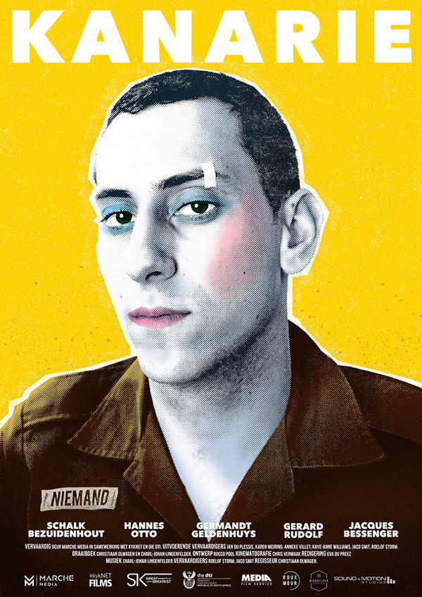
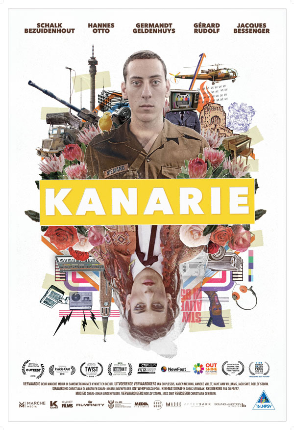
South African designer M.J. du Preez, who created the beautiful artwork for Kanarie, has been working with director Christiaan Olwagen for a long time. “Olwagen studied drama with my sister,” du Preez explained to me. “As the older brother who could design and illustrate, I was the obvious choice to help them out with all their productions. After university, Olwagen kept asking me as he progressed from directing plays and theater pieces to films.” While the two collaborate over long distances—du Preez lives in the African bush and Olwagen in Cape Town—du Preez wrote that working together is pretty easy because Olwagen has such a clear vision. “Obviously, more people are financially invested in feature-length movies, so it happens that designs Olwagen and I agree on occasionally get pushback from the investors,” du Preez wrote. “Kanarie was particularly difficult. Everyone was touched by different themes in the film, and no one was a hundred percent sure which elements of the movie needed to be highlighted the most. That’s why we ended up with four different designs, I think.”
Set during the Apartheid regime, the coming-of-age war musical follows small-town boy Johan Niemand (Afrikaans for “nobody”) as he serves his compulsory two-year military training. His love for Boy George and Depeche Mode lands him a spot in the South African Defense Force Choir and Concert group dubbed the “Canaries,” who travel from town to town performing for the soldiers’ families. “Johan also struggles with his own sexuality and how he fits into the world,” Du Preez elaborated. “The yellow version is an ode to Eighties pop-music album covers: a bit of Culture Club, a bit of Grace Jones, and a bit of Andy Warhol. The main color scheme references the army and the era, with pastels hinting at what is underneath the surface of the main characters—out of sight for most, but visible to others. Don’t let the textured DIY aesthetic of analog printing, cutting, and photocopying fool you; the poster was designed entirely digitally.”
“Where the yellow poster only hints at Johan’s dynamic personality, the collage version is a more in-depth exploration,” Du Preez continued. “The top part represents the world he finds himself in. The imagery touches upon nationalism, propaganda, Afrikaner indoctrination, and the expectation to serve in the Apartheid state of the 1980s: all elements that expose a patriarchal system of control. The bottom part reveals Johan’s authentic self in his natural habitat. It shows what defines him as a person, like his love for music, his creative expression, and, to a very subtle extent, his conflict with understanding his own sexuality. The juxtaposition between the two sides speaks to the friction he experiences between who he is and who he is expected to be.”
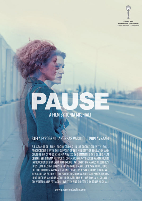
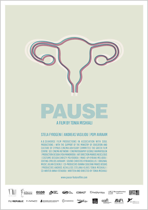
We continue with a different type of inner conflict. Cypriot designer Nasia Demetriou told me she landed the assignment for Pause through her work for the Cyprus Film Days International Festival, which Pause’s director Tonia Mishiali was also involved with. “Working closely with Mishiali, who provided me with a variety of photographic material as well as a rough cut of the movie, I enjoyed a relatively large degree of freedom,” Demetriou said. Pause follows Elpida, a middle-aged woman trapped in an oppressive and loveless marriage, as she fantasizes about violence against her indifferent husband. The thoughtful key art portrays Elpida’s inner conflict as two superimposed images in shades of cyan and magenta. (Key art is the iconic image at the center of a movie’s marketing campaign.) “The artwork directly relates to the central theme of the movie,” Demetriou continued. As Elpida loses herself more and more in her fantasies and the distinction between reality and fantasy starts to blur, “the double exposure of the image with small differences between the two scenes captures the dual version of various events in the movie.” The minimalist variant came at the suggestion of the director. Elpida’s character is reduced to a diagram of a uterus, the symbol of her womanhood. Because Mishiali and Demetriou liked both versions, both posters were produced.
Demetriou chose Helvetica Extra Bold to complement her refined artwork. While many versions exist, Neue Haas Grotesk is the most faithful to designer Max Miedinger’s original drawings. If you prefer a contemporary alternative with an edge, try Navigo or Paralucent.
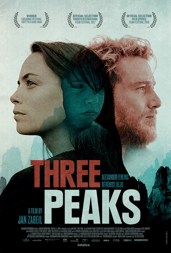
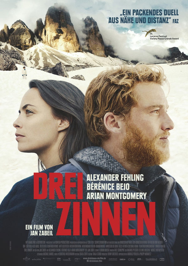
Propaganda B, the Berlin design studio founded by Helga Rechenbach and Ulrike Robben, produced both the domestic and international posters for Drei Zinnen (Three Peaks). In this German-Italian drama set in the Italian Dolomites, a man’s attempts at bonding with his girlfriend’s preteen son devolve into a dangerous struggle for dominance. Robben told me that they designed the English version for the global sales company first. The poster sports a gorgeous color palette and strong typography. Cleverly using monochromatic images in tasteful hues, Propaganda B visualized the conflict at the heart of the movie as a photographic Venn diagram, with the boy as the intersection between his mother and her boyfriend.
The domestic poster illustrates how, sometimes, external factors and specific requirements can influence a design. It’s a good reminder to be cautious when judging someone’s work, since we may not have complete information. “We liked the original poster very much,” wrote Robben. “The German distributor, however, thought it was too gloomy; they argued that the film is more than just a drama. That’s why we reworked the design for the German release.” Even though Propaganda B basically used the same elements, the more conventional treatment of the photography makes for a weaker poster. The impact created by the simplified color scheme is missing, and the boy standing underneath the titular three peaks is a bit lost in the majestic surroundings.
The compact sans serif is Neue Plak Black Condensed. The aforementioned Paralucent also has condensed styles that would work well here; so would Titling Gothic’s narrow widths.
The Power of Rock
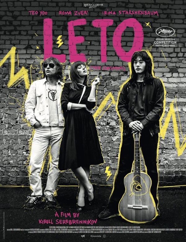
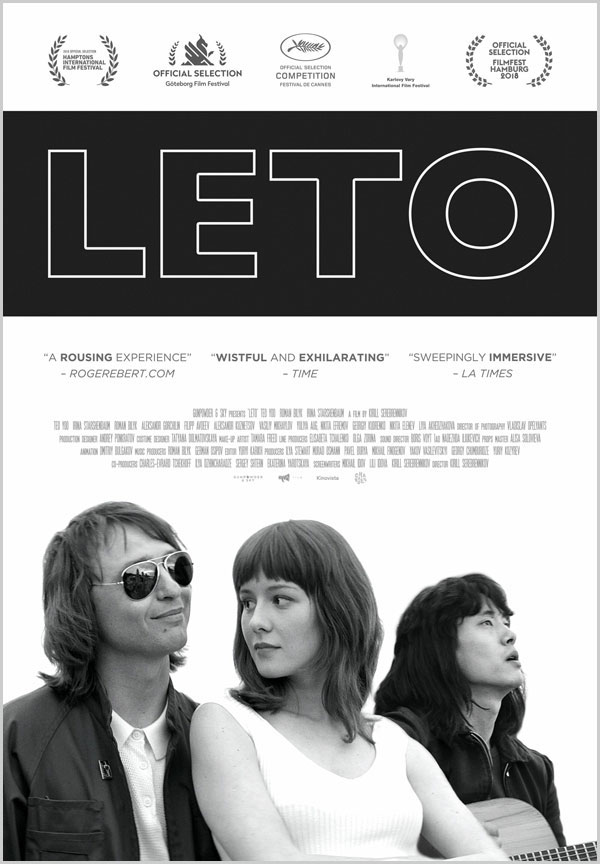
A similar compromise happened with Leto (Summer). In this celebration of the Eighties Russian rock scene, a love triangle develops between a punk-rock musician, his protégé, and his wife. The original international sales poster for Cannes 2018 shows that Paris-based design agency Le Cercle Noir has a clear affinity with music culture. Just like M.J. du Preez’ yellow poster for Kanarie, Le Cercle Noir’s design effortlessly adopts the visual language of the genre. Every aspect of the artwork, from the devil-may-care attitude of the actors in the grainy, black-and-white picture to the hand-painted lettering and energetic scribbles in magenta and yellow, reflects punk’s raw energy and exuberance. By comparison, the US one-sheet’s emotionally detached aesthetic seems like the polar opposite of the subject matter. I guess the distributor wanted a more pronounced focus on the relationship between the three protagonists. But by dressing the key art in spare black-and-white photography and clean sans serif typography, the link to the music that drives the story and represents the soul of the movie is all but lost.
Not everyone can be an experienced letterer, so it’s handy (pun intended) to be able to fall back on digital fonts that mimic this style. If you feel like kicking the dreadful Comic Sans to the curb—and, frankly, you should—take a look at FF Duper or Sketchnote. Intelligent built-in contextual alternates automatically introduce randomness into the letters for a more authentic hand-printed look.
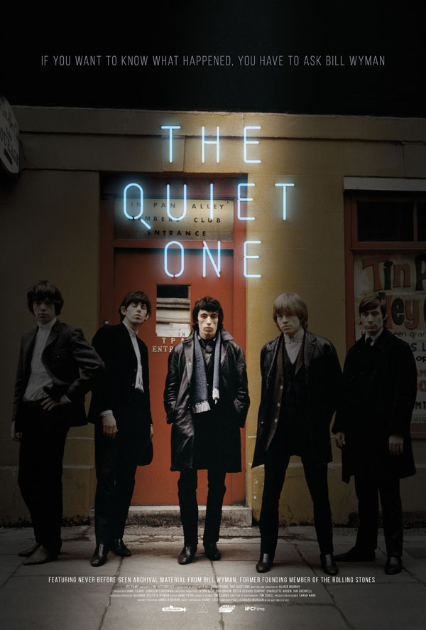
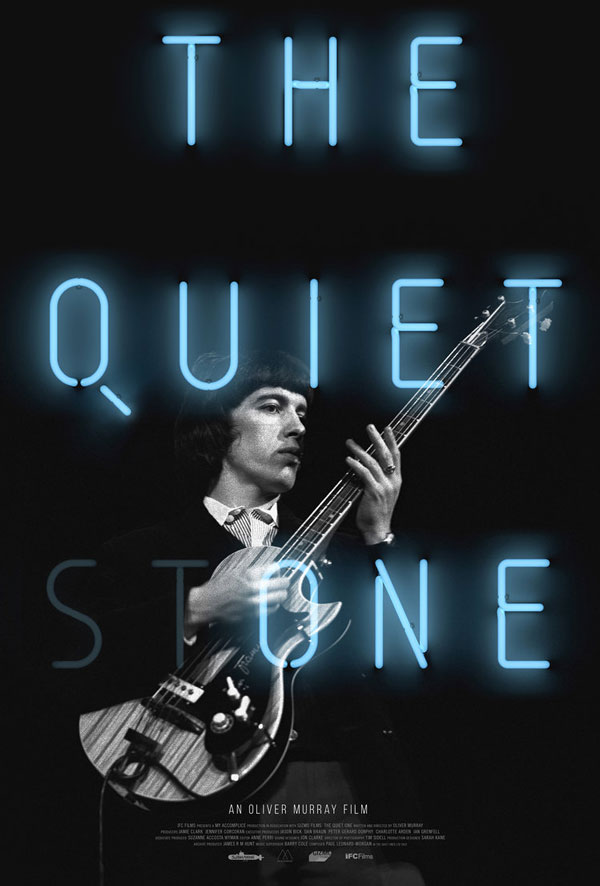
It’s impossible to mention rock and roll without thinking of the Rolling Stones. While the unstoppable septuagenarians are still touring the world, the highs and lows of the life and career of founding member and original bass player Bill Wyman, who left the band in 1993, is the subject of Oliver Murray’s first documentary feature The Quiet One. I asked Michael Boland of the Boland Design Company if it was difficult to find the right picture for the one-sheet, given so many iconic images of the Rolling Stones. “We received a fairly sizable selection of images from Bill Wyman’s personal archives that were cleared for use by Oliver Murray and IFC,” Boland says. “The photo for the theatrical one-sheet was just such a moment in time with Wyman front and center that it was a clear choice. The alternate version was prepared primarily for video on demand; the bold and simple power of that photograph worked best for that environment.”
“The title treatment is a photo of neon lettering and was combined with the main images in Adobe Photoshop,” Boland continued. “I do ninety-nine percent of my work in Photoshop alone, as it allows me the most freedom to think and discover what works. The particular letterforms appealed to me because they reminded me of some more contemporary sans serif typefaces. I always favor things that blur the boundaries between the time period they are actually from, and a more modern choice seemed right and a little less on the nose.” If you like the understated, technical look of the all-caps title, Korolev has the same circle arcs, straight sides, and external tail for the Q, while Rift Soft and Atrament also offer the rounded stroke endings on top of that.
While the main theatrical one-sheet already looks good, the typography in the video on demand poster adds a touch of genuine greatness. The multiple reading in Stone/One is one of those rare moments where the source material gives the designer a unique opportunity to do something exceptionally clever. “With the design being relatively direct, I was looking for a visual pun that could elevate the whole thing,” Boland explained. “While writing out ideas and sketching, it was my wife and copywriter Claire Boland who recognized that Stone contained One. Playing with the transparency made the whole concept come together. IFC liked the title treatment so much they had Intermission Film incorporate it into the trailer.” Discovering gems like these is the reason I write this column.
Lost in Gentrification
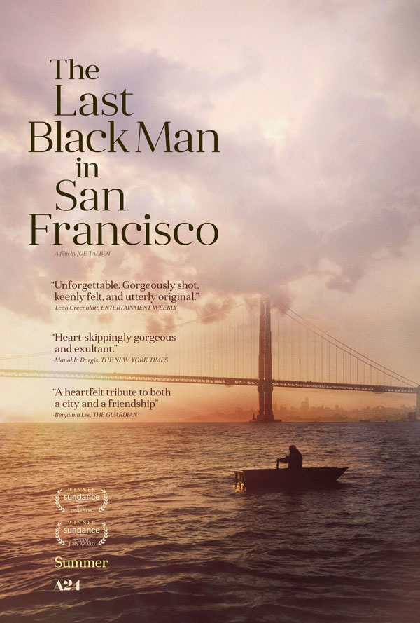
P+A’s understated theatrical one-sheet for The Last Black Man in San Francisco is a nice example of stacked typesetting. What at first looks like a fairly random alignment of Mint Type’s Anglecia is in fact well thought out. The stem of the capital T in “The” defines the position of the capital L in “Last”, the l in “Black”, and the left alignment of “San”. The left alignment of “Black” then corresponds with “Francisco”, and “in” is centered above “San”. As Lord Polonius said in Shakespeare’s Hamlet: “Though this be madness, yet there is method in it.”
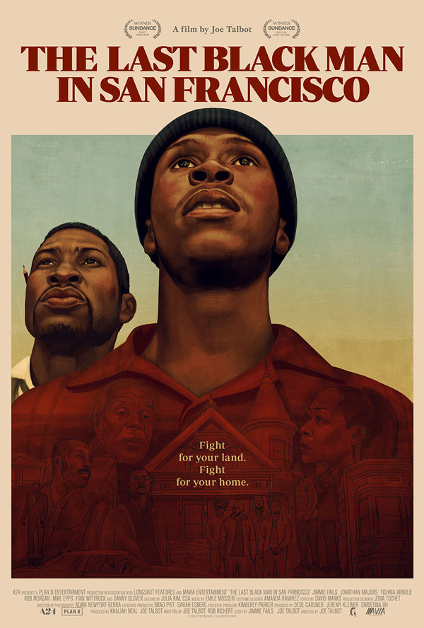
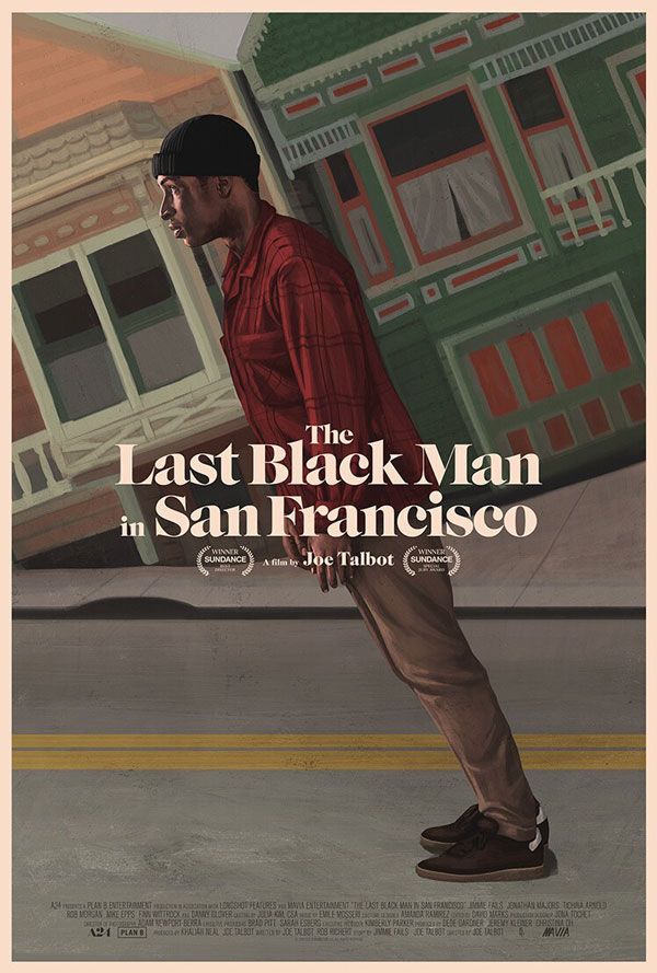
Akiko Stehrenberger designed two amazing painted posters for Joe Talbot’s drama about Jimmie Fails, a man who dreams of reclaiming the Victorian home his grandfather built in the heart of San Francisco. Stehrenberger told me that she worked closely with Talbot during the design process. “I presented many Jimmie-centric ideas,” Stehrenberger wrote. “Not only did I feel it was his story—‘Man’ is singular in the title—but visually it would look more iconic. However, A24 was adamant about showing both main actors at a specific moment in the film. Joe Talbot and I fought against it, and in the end A24 decided to go with two posters to appease both sides: the two-up illustration for A24 and the singular uphill one for Talbot and me. When the two-up illustration appeared in theaters, it received such an overwhelming response that A24 decided to make and sell it as a screen print. For the typography, I searched for a classic-looking face, while Talbot wanted something that also felt bold and strong. After trying many fonts, we settled for Periódico, as I felt it did a good job of both.”
I don’t like to use this word, as it gets thrown around far too easily, but what Stehrenberger calls her singular uphill poster is a stroke of genius. The design is disorienting at first as you try to make sense of the angle and the orientation of the houses and the man, and then—boom—the brilliance of the piece hits you. “I’m extremely proud of this design. The art represents the metaphoric and literal uphill battle in SF. It is slightly surreal, which feels appropriate to the film’s tone. The image also nods to San Francisco (without showing the Golden Gate Bridge) by showcasing the incredibly steep streets and houses the city is known for. The design was used for the screening promotional material: on invitations, postcards, and stickers. Because of how well it was received, A24 then made T-shirts using the image.” The fat face Caslon Graphique exhibits just the right mix of vintage hipness. Lust and Freight Big Black are contemporary alternatives that have the same dramatic contrast between thick and thin strokes.
Playing with Toy Story
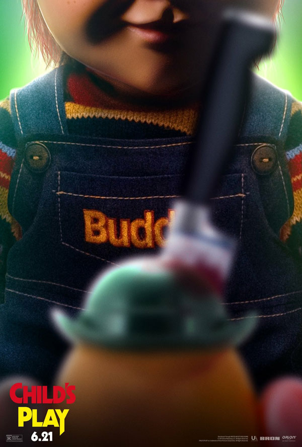
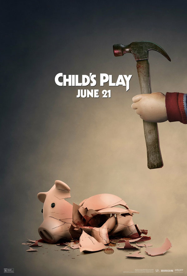
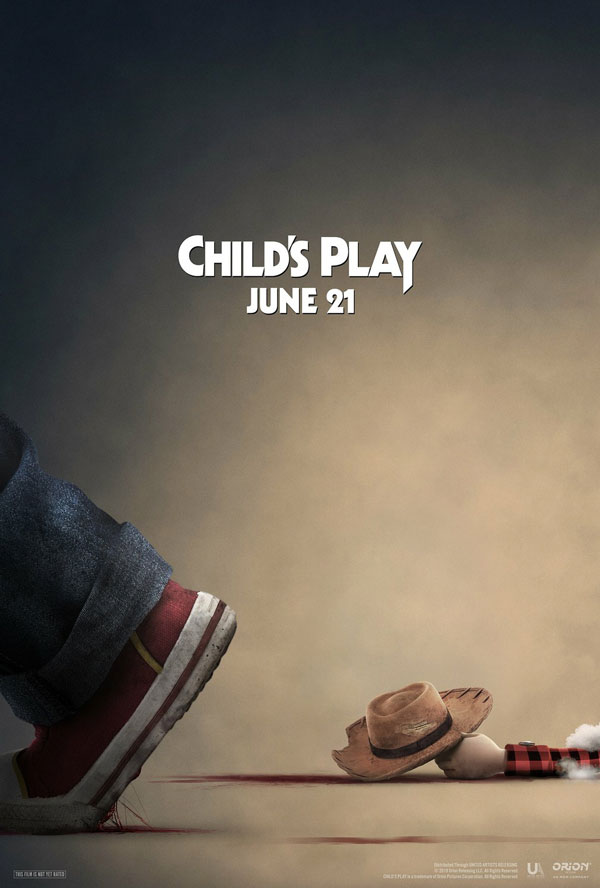
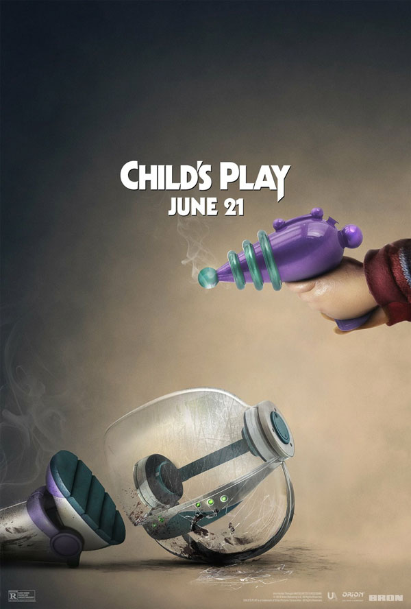
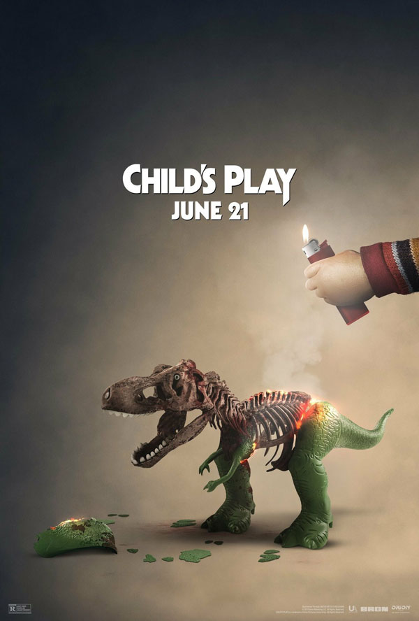
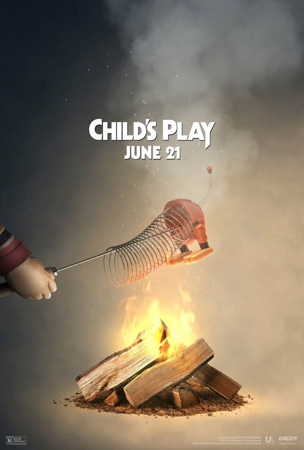
Readers who follow my ScreenFonts Instagram and Twitter accounts will already have seen this, but it is simply too good not to include as a little extra to this episode. The Child’s Play remake was released in theaters the same day as Toy Story 4, so Orion Pictures decided to engage in some high-quality trolling. In a series of morbid spoof posters, Pixar’s lovable toys all meet a gruesome fate at the hands of that, let’s say, less lovable toy, Buddi.
